Notifications
Logout
Are you sure want to logout?
Yes
No
Notifications


Full Name
Enter full name
Contact Number
Enter contact number
Enter valid contact number
Email Address
Enter email address
Enter valid email address

12 Oct 2021

12 Oct 2021
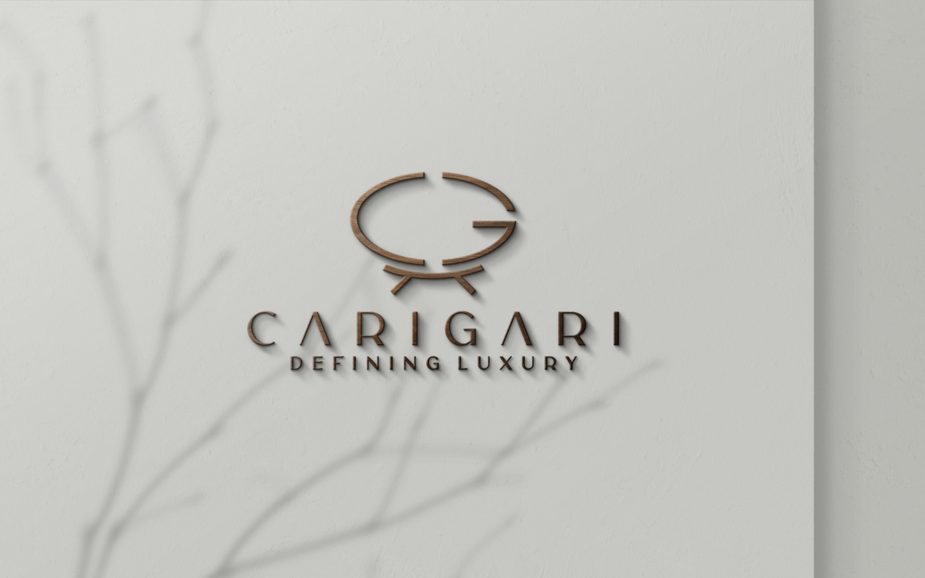
Carigari Logo represents a Conceptual Logo aligned in Lineart form made in Golden Ratio. It is conceptualized with the association of two letters C & G, that are placed on a Lotus Shaped Rajasthani, Two-seater Sofa which belongs to the Royal class. This indicates the royal essence to mind and business perspective in every way.
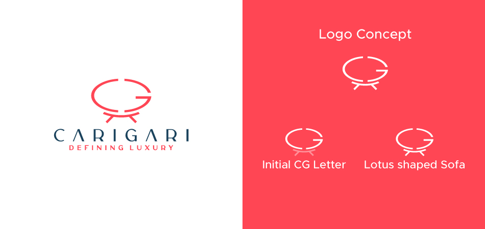
This colonial-styled feature is characterized by curves & turns to give a graceful appearance that symbolizes the engagement of customers. The entire bench is designed like a lotus, where the upper sitting portion is curved intricately & in the middle of the curve, the letters C & G are placed that highlight the Carigari is there for comfortable seating. The two-seater bench is an ideal example of immaculate artistry & sophisticated design. This tends to give a luxury look to the design.
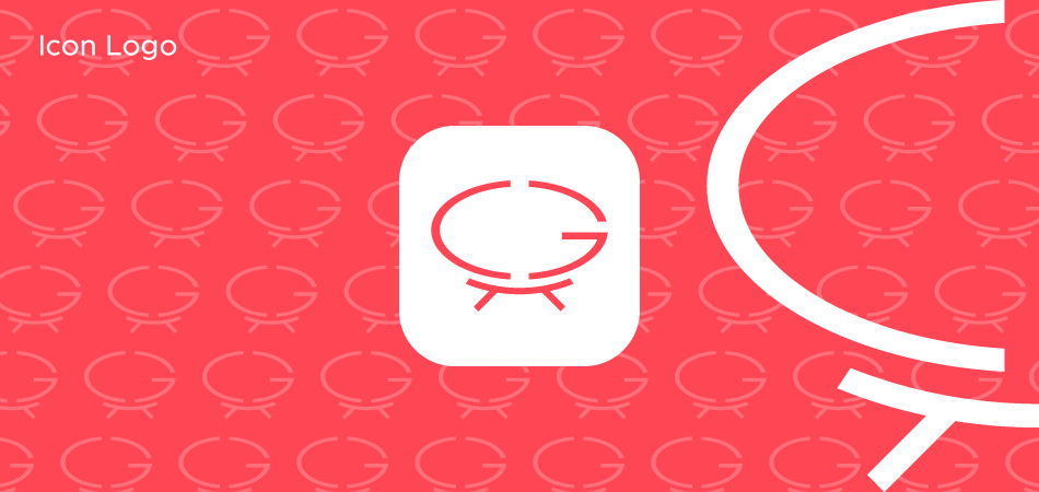
The Logo is simple and exceptional in its aspect. Its appealing formation helps to stabilize it on the path of professionalism without affecting its uniqueness.
It shows complexity with different functions that could be remembered even after a long time, and more than it is a long-time memorable logo that will enable its glimpse in the minds of people for a very long time making it shortlisted in the list of memorable logos.
All of us heard about the terms related to the logo that indicates icon, mark, brand, and emblem. These terms are probably used by people who are into the business of Graphics.
An Icon Logo goes is associated with the attribute that promotes brand recognition in the market. It helps to empower the industry to differentiate their products services from the other creatives with greater effects.
Iconic logo design is considered as a symbol that conveys strong, universal values and ideas that make it recognize in a convenient way. It shows straightforward nature and bold representation of a company. An icon can be in the shape of a recognizable item, it is typically changed in an abstract way to make it stand out in an appealing way.
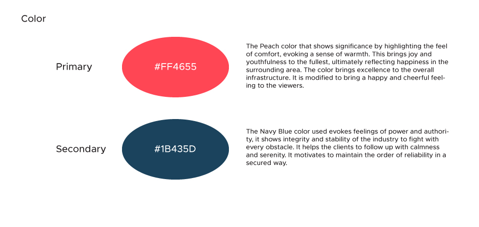
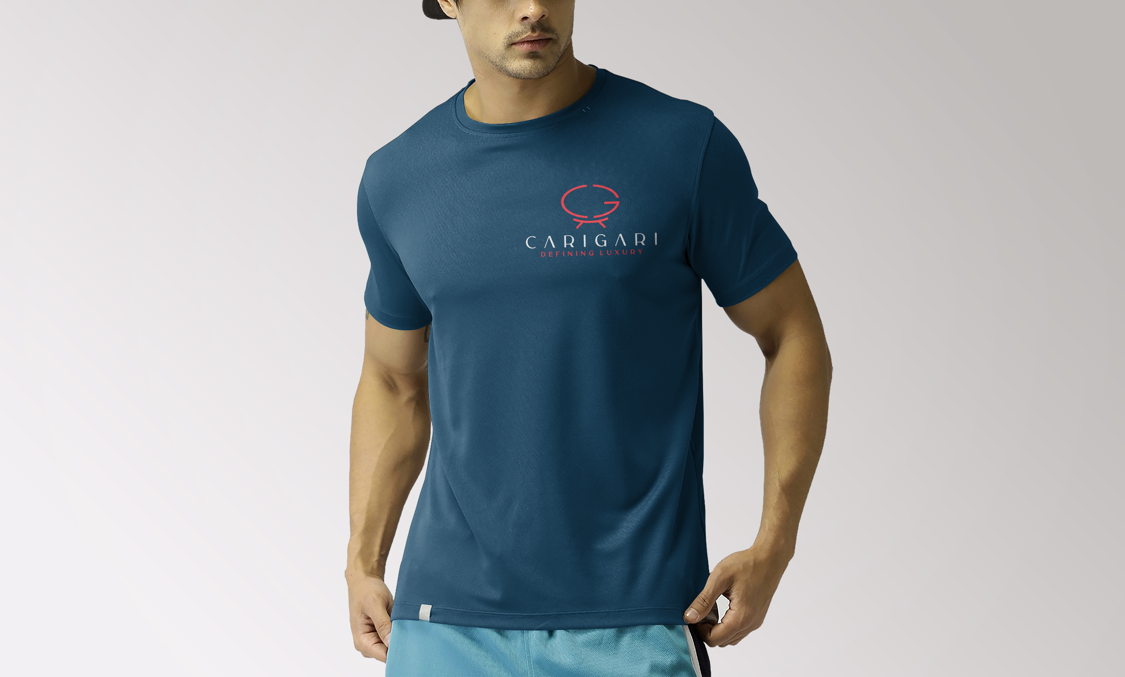
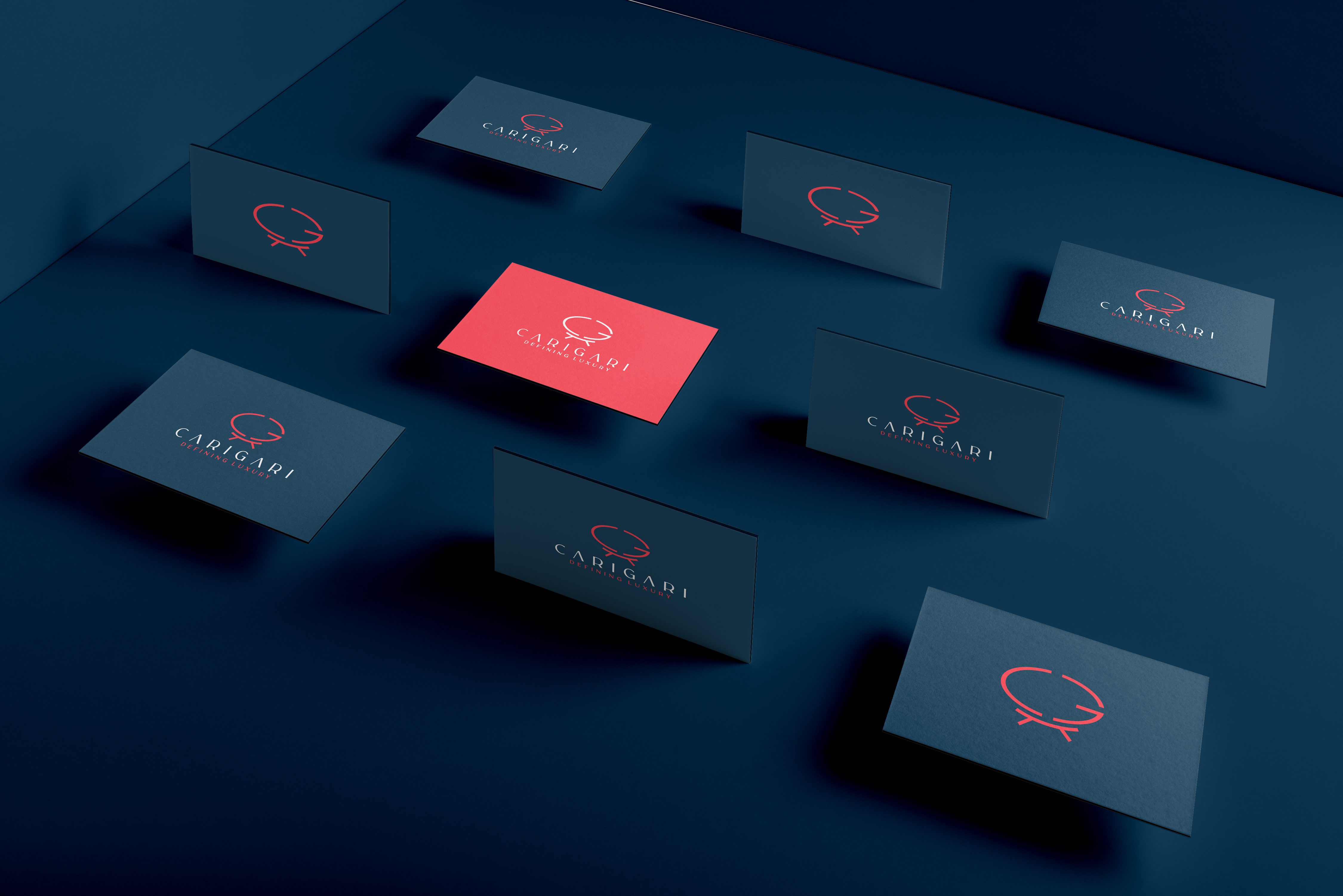
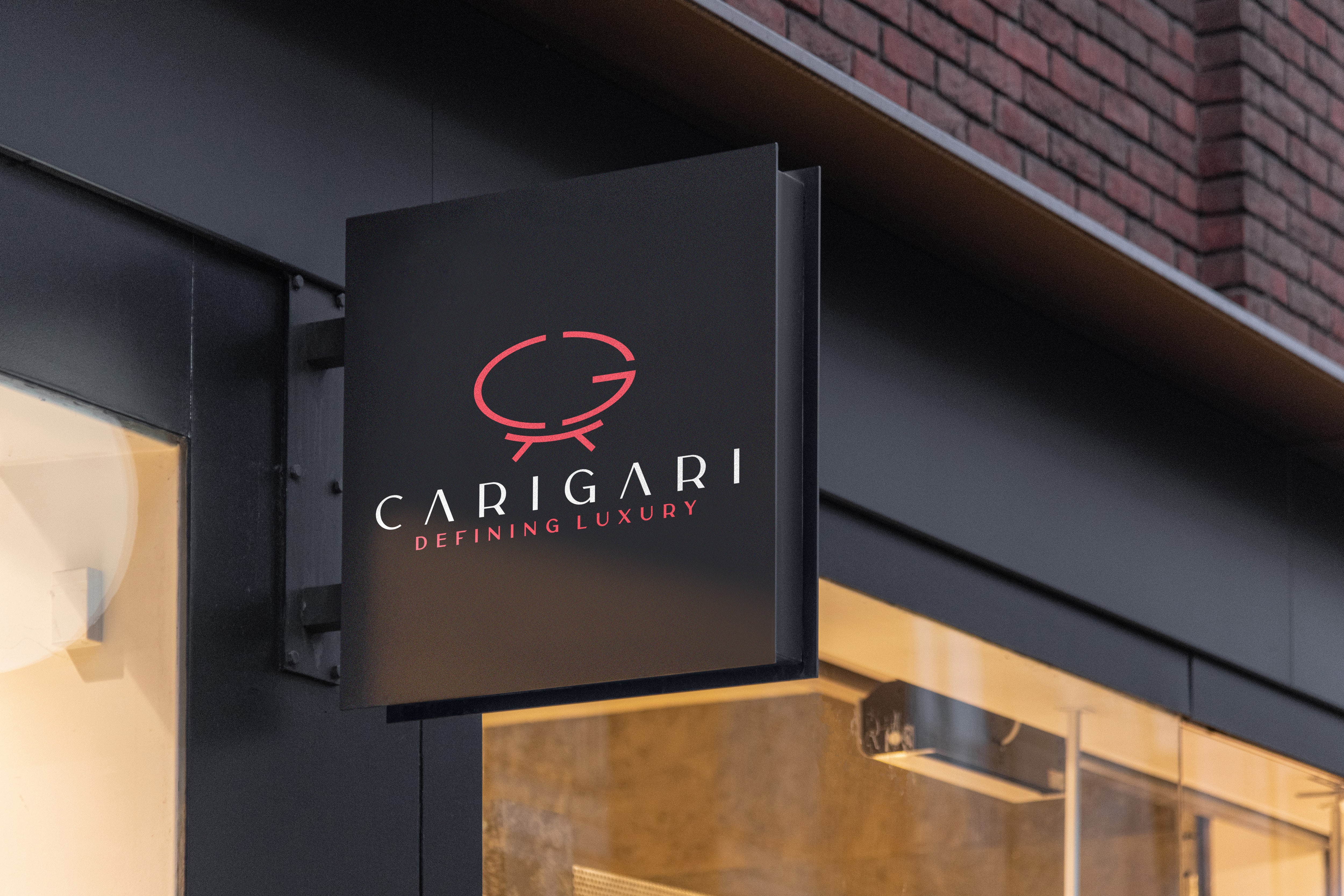
The letters C & G are filled with the Peach color that shows significance by highlighting the feel of comfort, evoking a sense of warmth. This brings joy and youthfulness to the fullest, ultimately reflecting happiness in the surrounding area. The color brings excellence to the overall infrastructure. It is modified to bring a happy and cheerful feeling to the viewers.
The Navy Blue color used evokes feelings of power and authority, it shows integrity and stability of the industry to fight with every obstacle. It helps the clients to follow up with calmness and serenity. It motivates to maintain the order of reliability in a secured way.
The colors are selected based on their tastes and preferences. Most of the designers would do best to refer to the basics of color theory.
One of the simplest aspects of the given concept is the use of the proper color combination. This shows the artistic creation of a designer who created a color combination that avoids straining the eyes of viewers.
Font plays a crucial role in delivering the right message to the target audience. It forms the foundation of a logo design that shows an ability to depict the values of the company in a positive manner.
The font plays an important role in denoting the tone of the text in an effective manner. Consider it to be a form of visual language. In addition to the different types of the font used for particular purposes, the font in a logo design adds up the essence of a brand. Each typeface can communicate a different meaning with a different perspective. These can highlight the emotions of the industry as well.
Large, bold fonts depict a loud, alarming tone that demands attention while tiny fonts which channel subtlety sound more demure and polite. The tone of the font is of utmost importance as it provides a distinctive perspective to your brand. Therefore, the typeface should always be inclined with the tone of the message the industry wants to convey through the fonts of the logo.
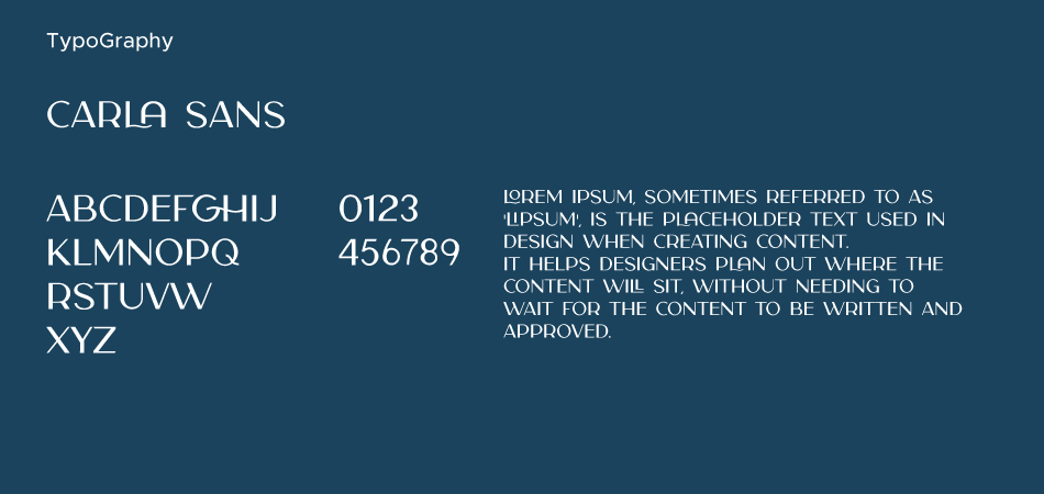
The font used in the given Logo represents the Carla Sans which is considered a very versatile font that works great in large and small sizes as well. It shows its perfectness when used in branding projects, Logo design, magazine headers, or simply as a stylish text overlay to any background image, as these are most pleasing to the eyes. These are used to signify superiority in a modern way.
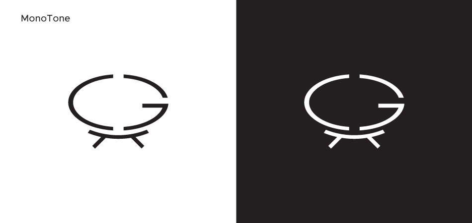
Monotone indicates using of only one color. This is particularly used to mean black and white. Removing color means that the images rely fully on tone to describe light, shape, and form. Like many photographers choose to work with black and white images.
Monotone when used in a proper way while designing, monotone colors deliver a result that is smooth, elegant, and comfortable to the eyes.
When a logo designer wishes to grab the attention through graphic design, then it becomes mandatory to understand how to use the color schemes or monotone. With monotone colors, the colors the designer use usually depend on the product you are designing.
Submit Design
Height and Width should be the same (e.g. 1000 x 1000)
Supported file formats : .JPG / .JEPG / .PNG

Submitting...
Submit Design