Notifications
Logout
Are you sure want to logout?
Yes
No
Notifications


Full Name
Enter full name
Contact Number
Enter contact number
Enter valid contact number
Email Address
Enter email address
Enter valid email address

12 Jul 2022
 (1) (1) (2) (1).gif)
12 Jul 2022
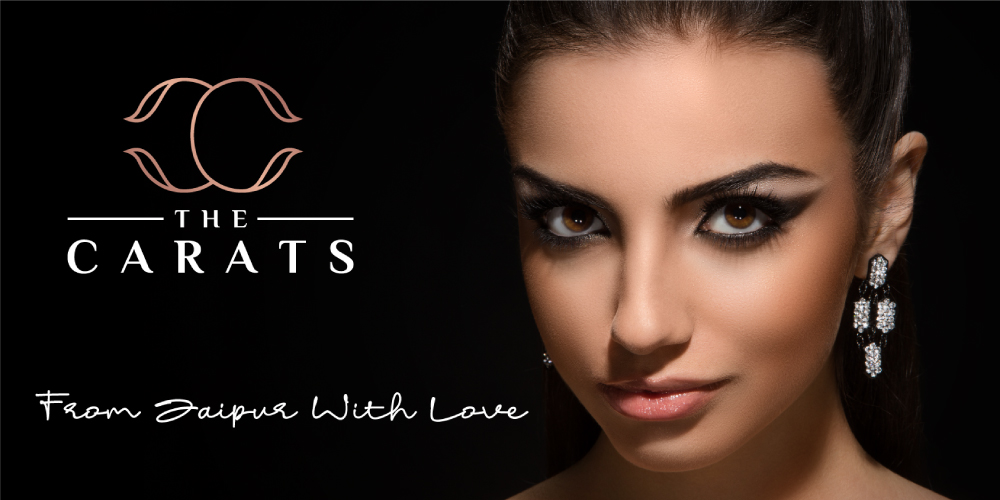
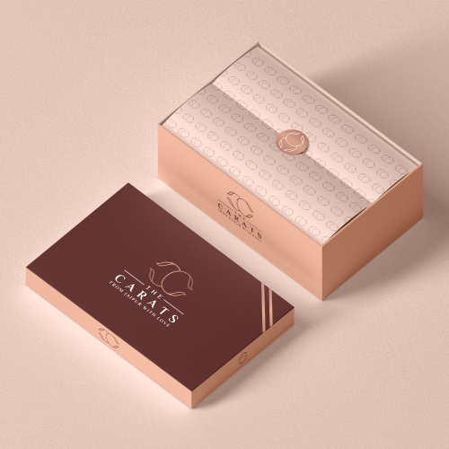
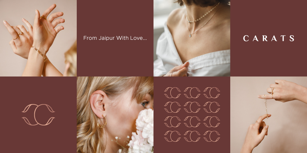
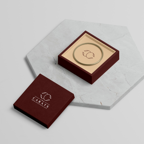
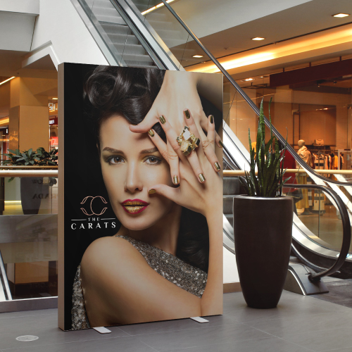
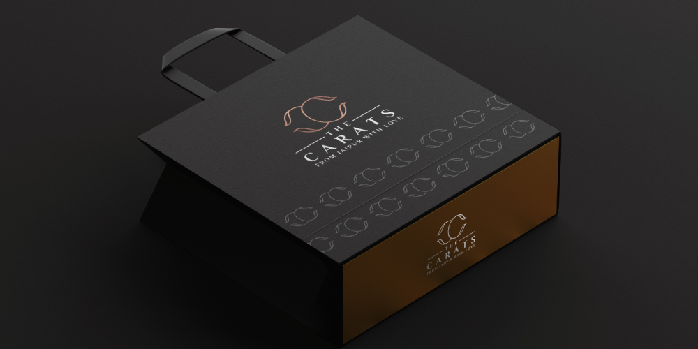
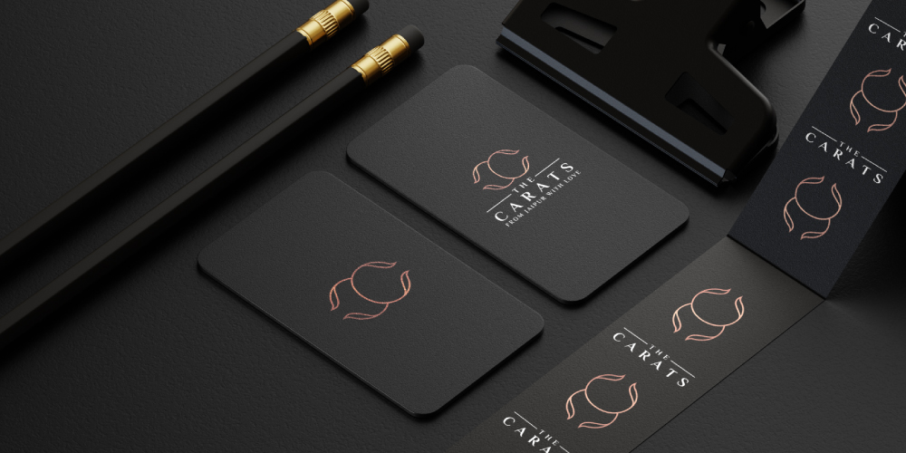
The Carats is the type of Luxury Initial Logo. It represents the C-C letter which is designed in a clean and elegant manner. It signifies the company serves the customers with luxury Diamond Jewelry and satisfies their needs. The colors associated with the logo design highlight the prestige, success, wealth, and prosperity aligned with the services.
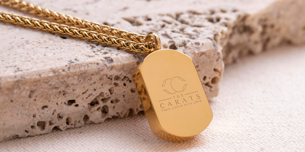
Diamond jewelry provides a high-valued and luxurious look to individuals. It is associated with rigidity, infrequency, and exceptionality which provides shows the social and economic status and success. It reflects shining and purity and shows significance extremely. These are considered as one of the most passionate gemstones in the world. The Diamond jewelry gives an elegant and classy look to the people wearing it.
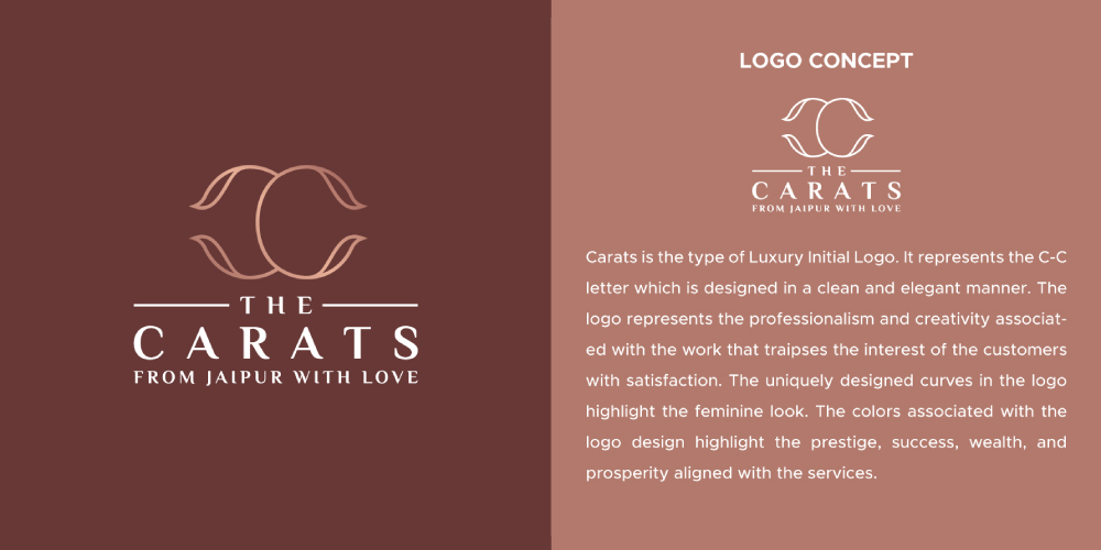
Carats is the type of Luxury Initial Logo. It represents the C-C letter which is designed in a clean and elegant manner. The logo represents the professionalism and creativity associated with the work that traipses the interest of the customers with satisfaction. The uniquely designed curves in the logo highlight the feminine look. The colors associated with the logo design highlight the prestige, success, wealth, and prosperity aligned with the services.
The Carats is the Initial Logo. The Initial Logo uses initial letters with the logo designs. It arranges the initial letters in an exceptional manner to attract the attention of the people. When these initial logos are designed in a minimalistic manner, then it becomes memorable. It is designed creatively and is mostly used for businesses with long names. The logo is fascinating, which shows the strategic and stylish use of all the design elements, that traipse the attention of the people with the association of appealing colors, artistic design, typography, and creativity.
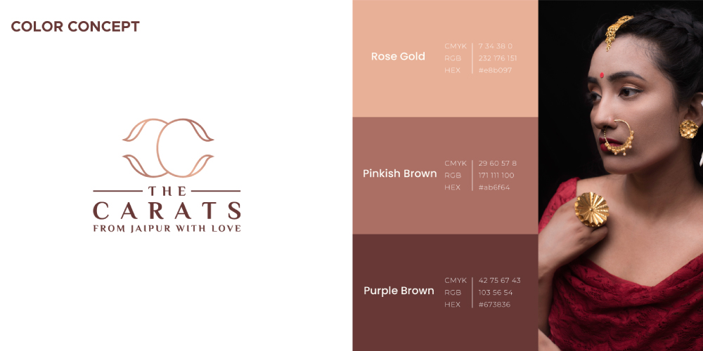
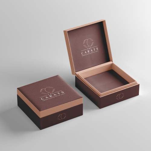
The Carats logo is associated with Rose Gold, Pinkish Brown, and Purple Brown. Rose Gold portrays a sense of elegance and style, but also an awareness of fashion, trends, and even wealth. It is a shade of pink, and is considered feminine.
It is often been described as a gender-neutral hue. The given logo is also associated with a Pinkish Brown color that represents feminity and security, and also a Purple Brown color, which represents royalty, nobility, power, ambition, and resilience, that
makes the logo look elegant.
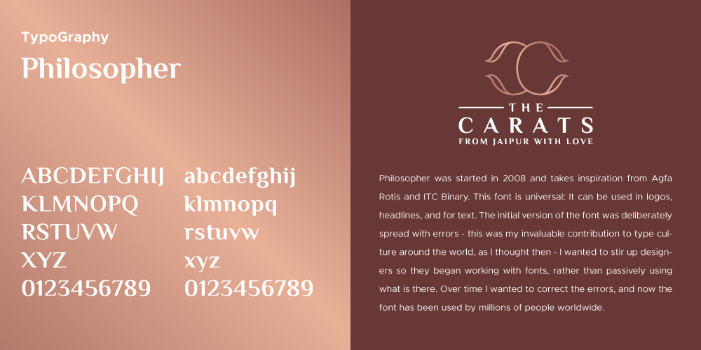
Font plays a crucial role in delivering the right message to the target audience. It forms the foundation of a logo design that shows an ability to depict the values of the company in a positive manner.
The font plays an important role in denoting the tone of the text in an effective manner. Consider it to be a form of visual language. In addition to the different types of the font used for particular purposes, the font in a logo design adds up the essence of a brand. Each typeface can communicate a different meaning with a different perspective. These can highlight the emotions of the industry as well.
Large, bold fonts depict a loud, alarming tone that demands attention while tiny fonts which channel subtlety sound more demure and polite. The tone of the font is of utmost importance as it provides a distinctive perspective to your brand. Therefore, the typeface should always be inclined with the tone of the message the industry wants to convey through the fonts of the logo.
The font used in the given Logo represents the Philosopher font which belongs to the Sans-Serif family. It is used perfectly and precisely with the logo design, which grasps the attention of the people, and is pleasing to the eyes.
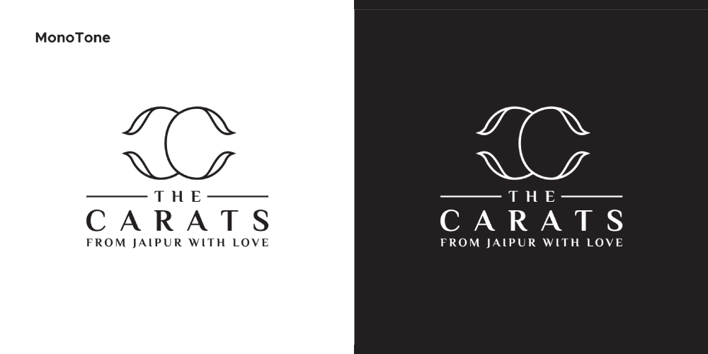
Monotone is associated with the use of only one color in the logo, which is either Black or White. When The Carats logo is associated with Monotone, then it reflects its uniqueness with clarity.
It shows a clean, simple, and bold look, that attracts the attention of the viewers. It reflects a sense of authority, which shows elegance in an exceptional manner.
It also evokes power and strength and is aligned with purity, perfection, and clarity. It shows classiness and dignity, and also gives a modern or minimalist feel.
Submit Design
Height and Width should be the same (e.g. 1000 x 1000)
Supported file formats : .JPG / .JEPG / .PNG

Submitting...
Submit Design