Notifications
Logout
Are you sure want to logout?
Yes
No
Notifications


Full Name
Enter full name
Contact Number
Enter contact number
Enter valid contact number
Email Address
Enter email address
Enter valid email address

11 Nov 2021
11 Nov 2021
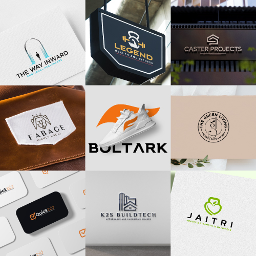
In the earlier blogs, we have studied that when a business gets ready to fly, then it arranges the feathers for itself in the form of Logos. A company needs to follow all its responsibilities correctly, then the logo would help it to create a good connection between the consumers and the organization. The Logo can be considered as the soul of any brand, industry, company, or any small or big organization. Let us look at the top nine logos of October 2021, created by the team of designers.
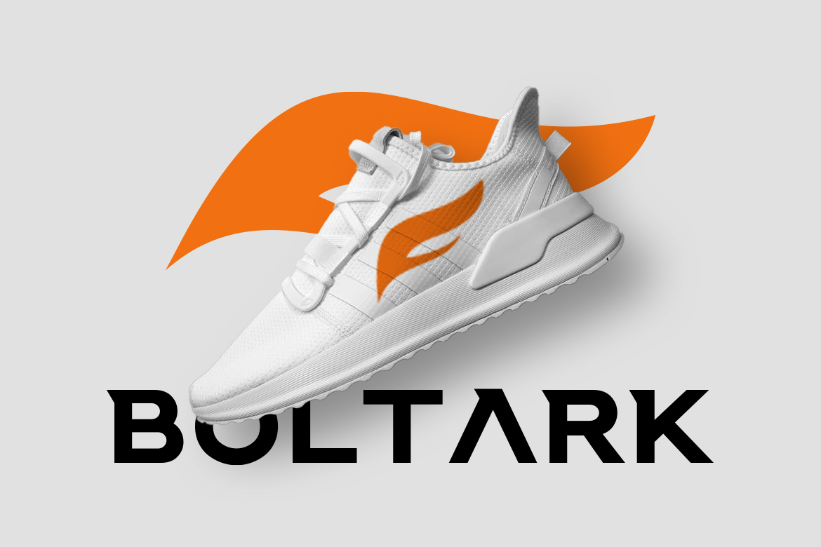
The sneakers brand becomes reliable with slightly upper range product, that brings more fashion to the youth. The young generation must change themselves to change their normal buying habit of sports shoes to more fashionable sneakers. Here comes the need for such kind of logo that brings enthusiasm to real life.
The given logo is the type of Iconic Logo. As simplicity reveals beauty so it should be straightforward, as the sharp outline of the given logo. This showcases the efforts of an organization in a beautiful way. The great attribute and advantage are that it is easy to remember even after a long period. The logo is represented clearly to communicate with the consumers or audience.
It represents the Eagle wings that show the strong feeling, powerful vision, and soaring high with full capacity. It represents the leadership qualities of the industry and plays a vital role in emphasizing the design of the brand to the audience. It also helps to distinguish the business of an organization from the other.
Orange color highlights joy, warmth, heat, sunshine, enthusiasm, creativity, of the industry that brings success, encouragement, and change. It also represents the high determination of the industry that brings happiness, fun, enjoyment, and balance for its customers.
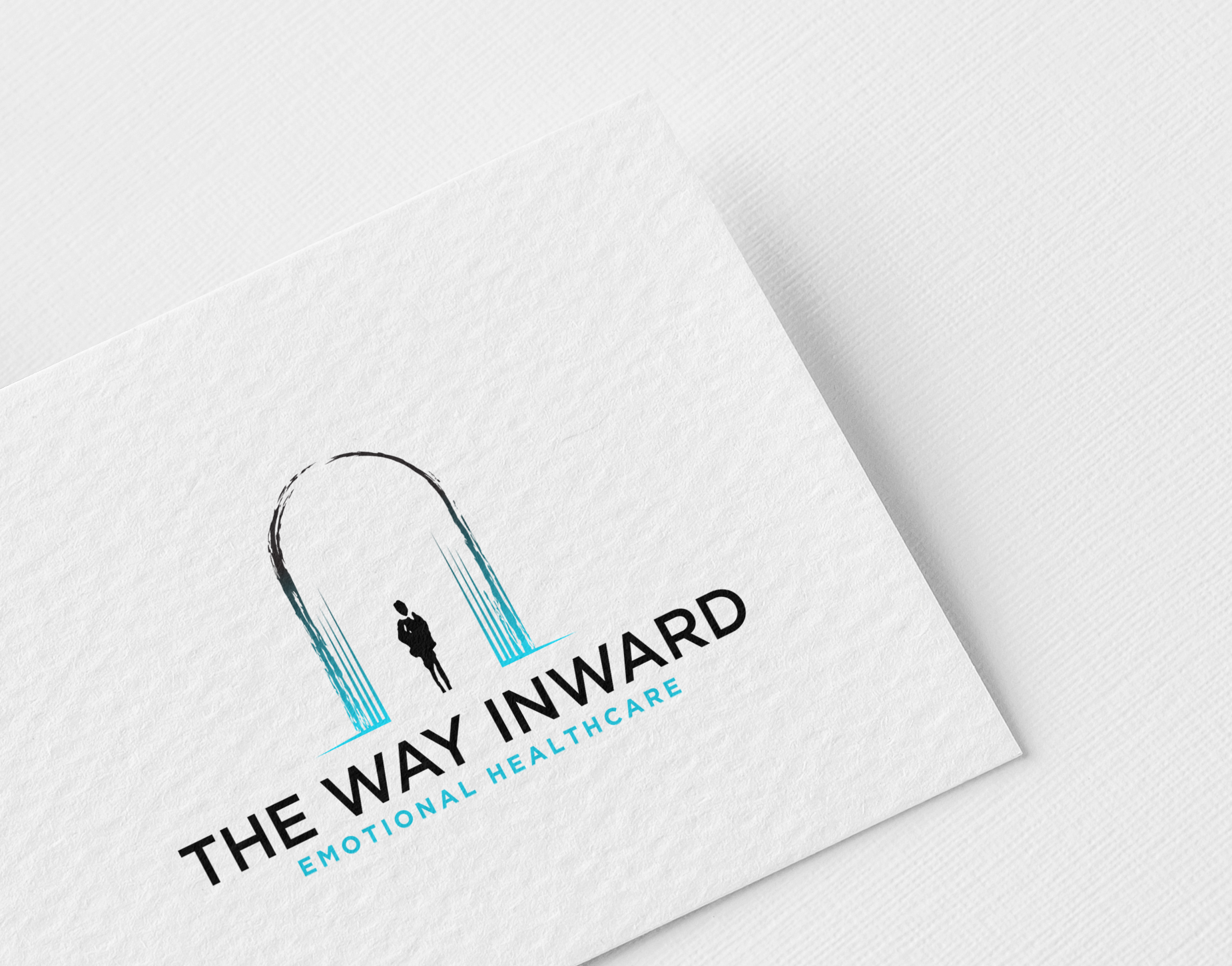
When people get stressed and want themselves to come out of their hectic thoughts. Then there comes the need for mental healthcare consultants or providers, who provide people of all ages with a Safe Space to Talk and Explore their Inner World to improve their existential functioning and emotional mastery, and hence improve their experience of the external world.
The given logo represents the Iconic Logo. designed in a unique way to express specific things about the brand. This presents the efforts of an organization in a beautiful way, which would attract a large audience with its artistic creativity. It states an impressive feeling and has a glimpse of professionalism that gives a background to any organization.
It is surrounded by an archway with an abstract person that gives an artistic feel. It is based on the idea that here a person is going through a portal to their inner world, which is wild and chaotic, but unexpectedly turns out to be beautiful. It is compatible with the brands that want to show themselves as reputable, soothing, and beautiful.
Blue is the most universally favored color of all and therefore the safest to use in terms of business. It relates to trust, honesty, and dependability, therefore helping to build customer loyalty with the product or brand.
The blue color used highlights the confidence of the industry, reliability, and responsibility. It signifies the one-to-one communication of the industry with its customers. It shows wisdom and higher ideals of the industry and is also conservative and predictable.
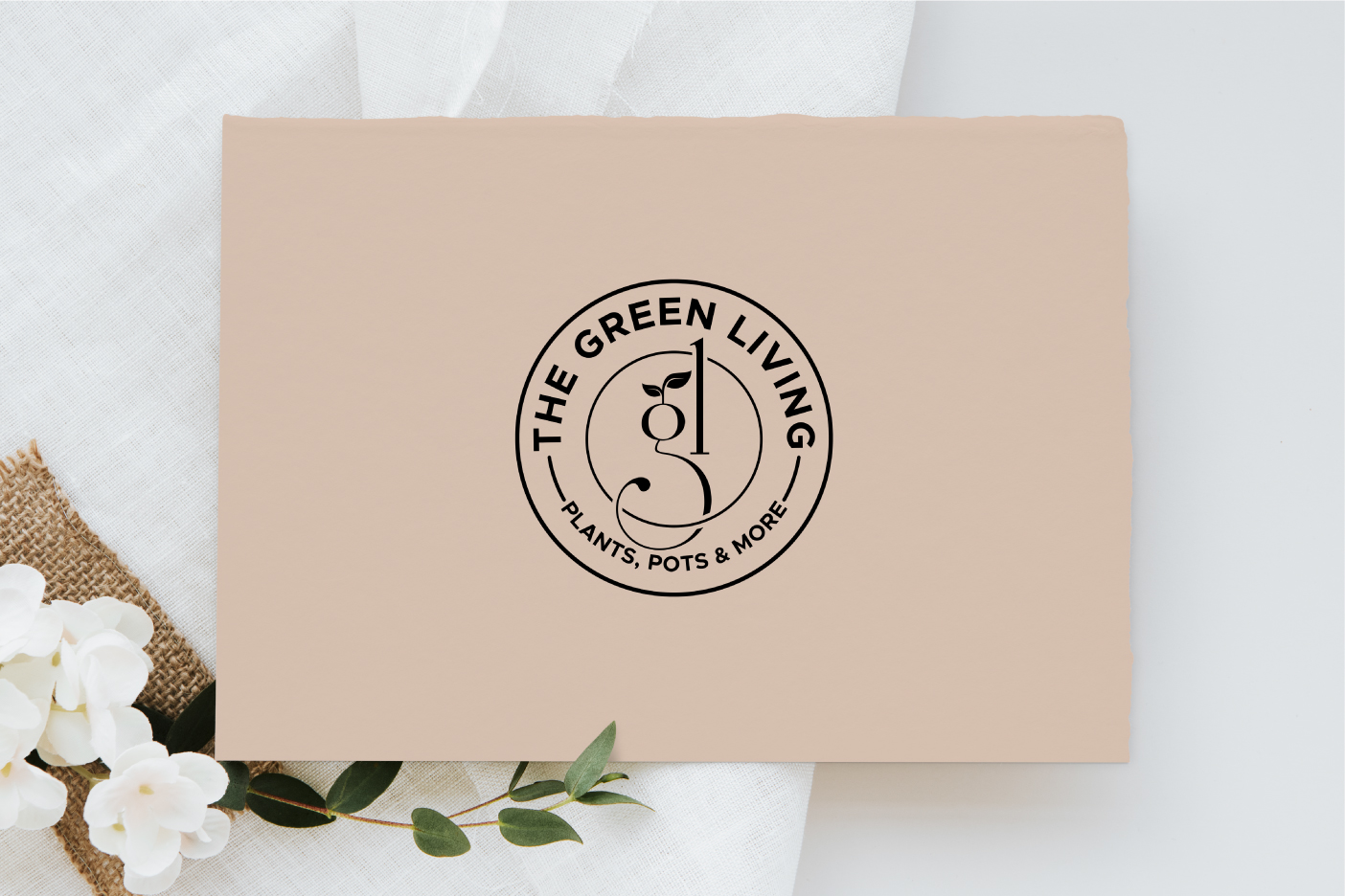
All of us want to decorate our house sights with beautiful plants, hence we find a retail business that sells different live indoor plants, designer pots and planters of different materials, garden decor, and house decor items. When we feel to make our surrounding area gives feel like a garden, then we move on to look for some greenery. We plant a nursery and bring the greenery in our field.
The given Logo is the Emblem Mark Logo. It states an impressive feeling. These logos consist of a seal or a crest. Do think about the universities or the government organizations which have a memorable and long-lasting impact on the mind of a person. These are compatible with the brands that want to show themselves as reputable and traditional.
It shows initial G and L with a leaf that signifies the greenery and is vital for good health and growth. It depicts hope, renewal, and revival of the industry at times of misfortunes. It also represents nourishments, good spirit, and hope.
The use of bright yellow color in the given logo shows its attribute in an attention-getter, and it highlights enthusiasm and enlightenment of the company or brand that highlights the passion with stability. In practical terms, it highlights the silver lining of a cloud that removes the crestfallen nature. The color is associated with warmth, sunshine, and positivity.
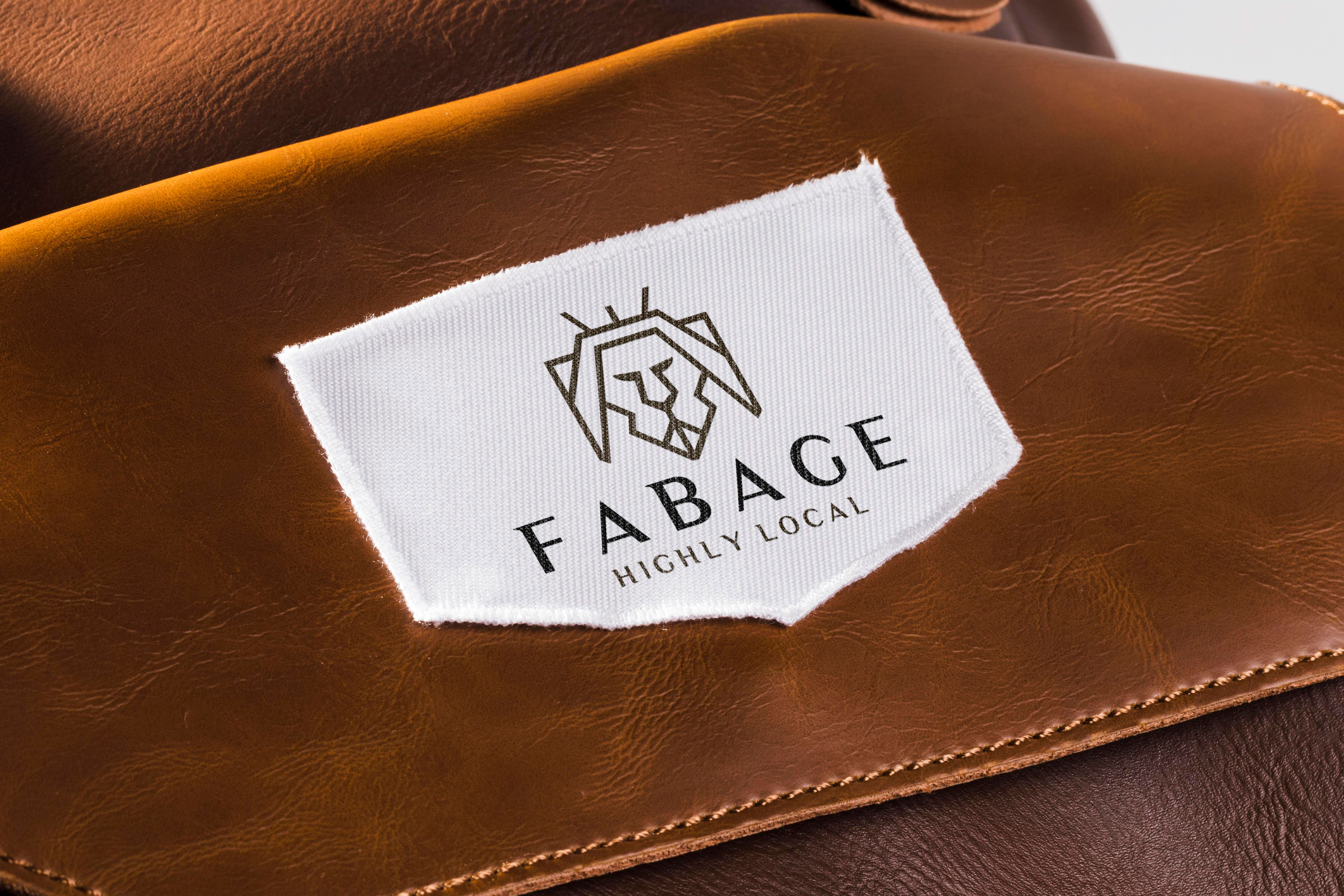
Leather goods like belts, wallets, purses, and office bags played a significant role in providing clothing, shelter, footwear, seating, and comfort for all of us in different ways. It makes a significant contribution towards economic growth, balanced regional development, and employment generation as well. It is one of the easiest materials to clean, making it a great choice for all of us.
It is the Luxury Iconic Logo that speaks about versatility. It allows easy rebranding. As the company or product name will be associated with the image; so the customers will get a direct point of view about the brand. It is quite clear to the audience which does not require any guessing. It has great benefits as it gives a professional and high standard look and makes effective designs in it to highlight the brand of the organization.
It consists of the Lion with the crown in a linear manner, that represents majesty, strength, courage, and justice, which helps in bringing royalty to the industry. The crown at its head shows the power, legitimacy, victory, triumph, honor, and glory of the industry that satisfies the needs of its customers by delivering high quality.
The luxury color highlights illumination, love, compassion, courage, passion, magic, and wisdom of the industry with its customers that helps in an escalation of the prosperity of the industry in hundredfold.
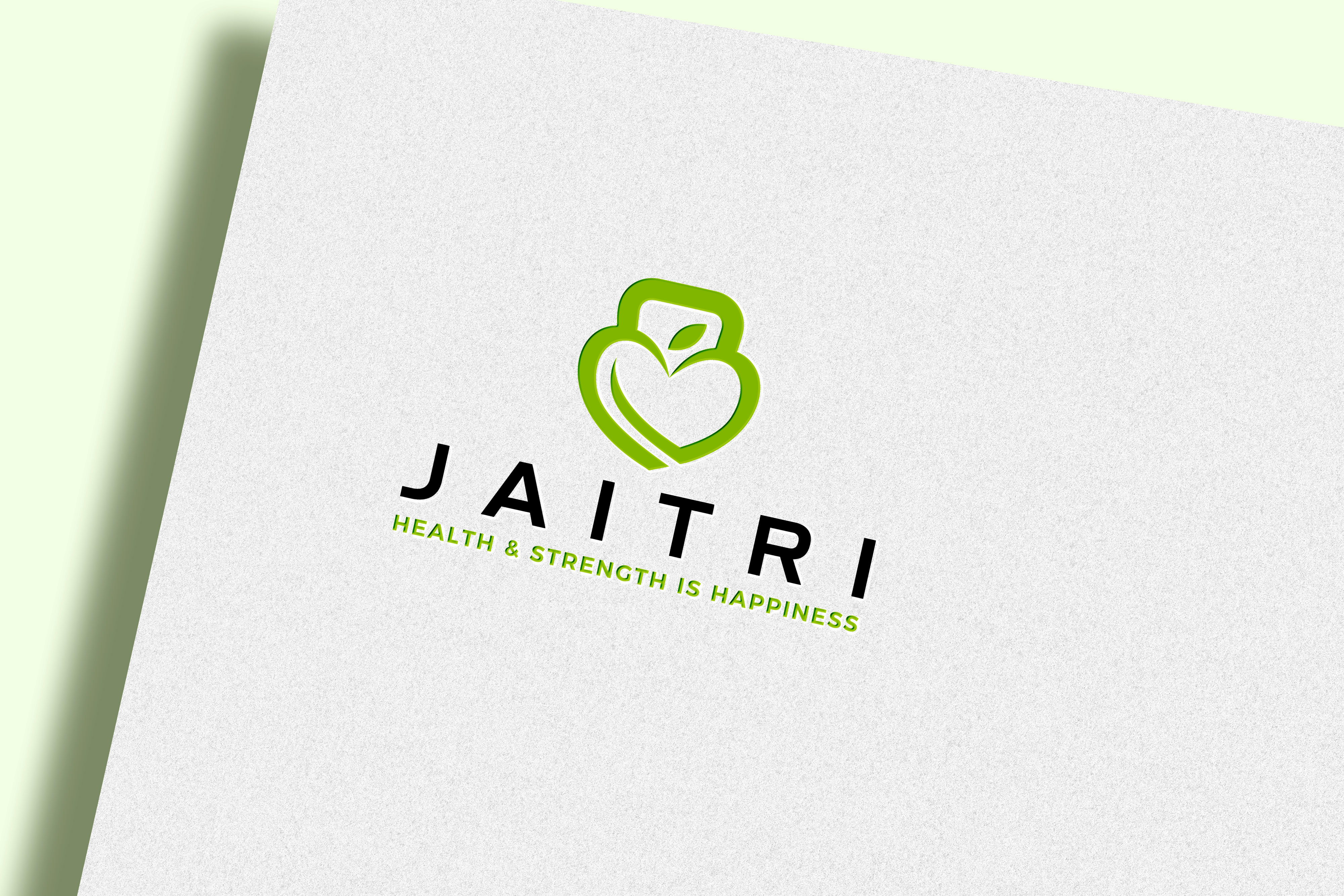
Healthcare, nutrition, and dietician. When people suffer from some diseases like thyroid or diabetes and also think about weight loss or gain, then we look to bring change in the lifestyle. Here comes the need to get consulted by a nutritionist, healthcare expert, and dietician.
It is the type of Iconic Logo that represents Kettlebell associated with an Apple and Heart. This signifies the step taken by the industry to provide a better healthful service to its customers in a professional manner, that brings enlightenment. It symbolizes the eternity of the group to get the customers associated with prosperity. It also shows increasing strength, performing specific movements, and designs that help to build strength and endurance.
The Green color highlight the cheerful efforts of the industry. The Green leaf symbolizes the spread of greenery. The industry grabs the attention of the people with the help of these inspiring colors because the colors speak their language. It evokes calm emotional responses, which are conducive to establishing the trust needed to start just such an ongoing professional and personal relationship.
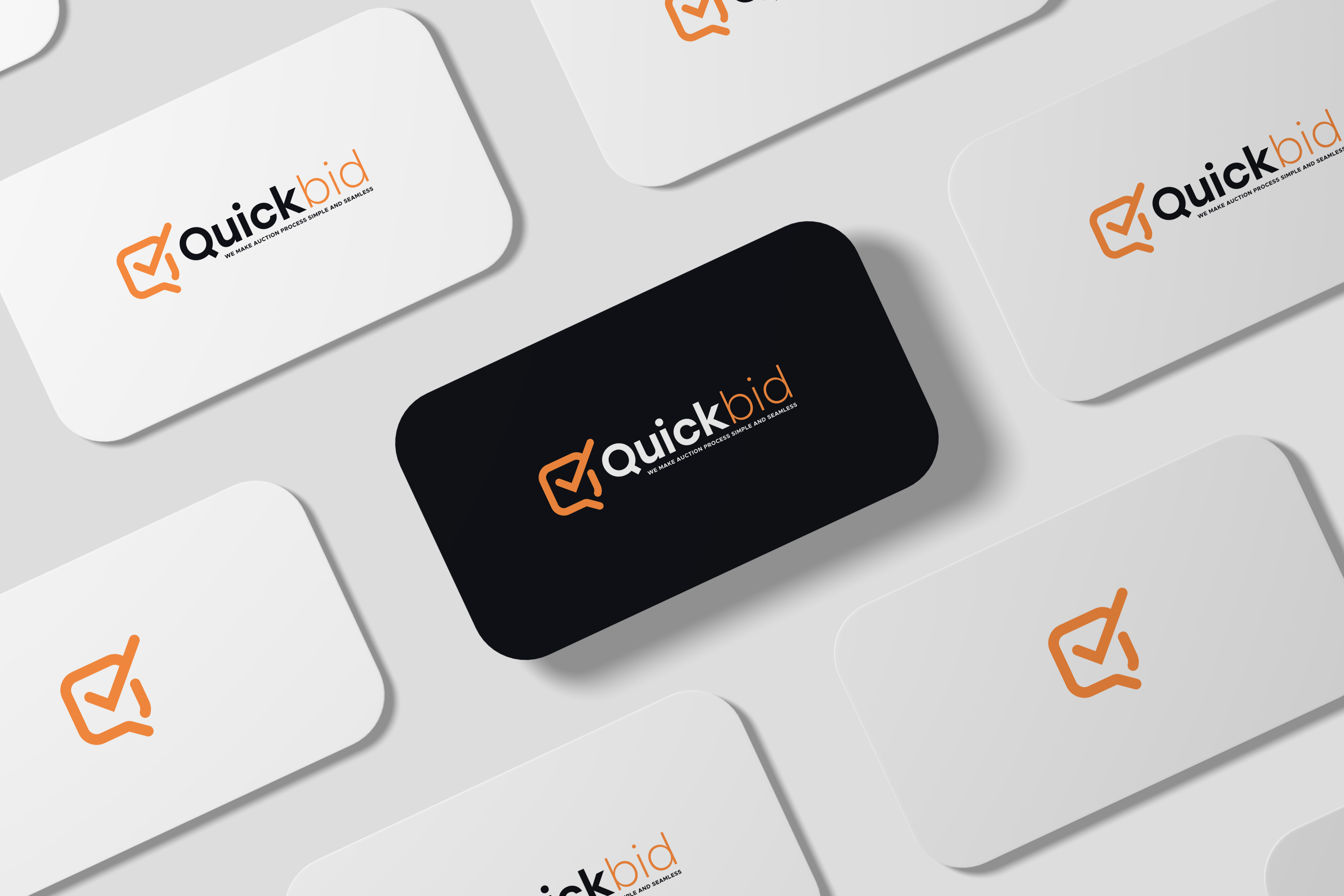
Auctions are considered as the best way that help to convert the assets to cash in a short period. Competitive bidding determines the best price for our properties. The auctions involve bidders competing simultaneously, which benefits sellers, gives value in potential competition, and obtains a good offer from a buyer. When there comes the need for such kind of auction, then the people look for platforms that sell the Bank Auction Properties, or Market place for all Properties in a single website with wider coverage of the properties.
It is the Combination Mark Logo that includes a combination of images and words. It speaks about versatility and allows easy rebranding. The logo of a company acts as its face or identity. It holds the power to replace the name of the company with modification and provide it with a beautiful design. It associates the name of the industry with the image; so the customers will get a direct point of view about the brand. It is attractive and easy to remember.
It shows the right tick mark that represents the completed task, an all is a good symbol, a positive reinforcement, or an indication of passing a test. It signifies confidence of mind or manner, easy freedom from self-doubt or uncertainty spoke with assurance about the plans, and excessive self-confidence as well.
The use of Orange color sparks bright responses and energetic feelings. It evokes happy feelings and energizing feelings for clients in the business. This color is most relevant to the industry and its customers. Orange helps a business to stand out from others by highlighting its nature that helps pull the customers on the path of satisfaction. It is the one that appealingly welcomes the customers. Here is how orange is usually used in the design- in the foreground to highlight essential elements, as the main color in the background to reflect feelings.
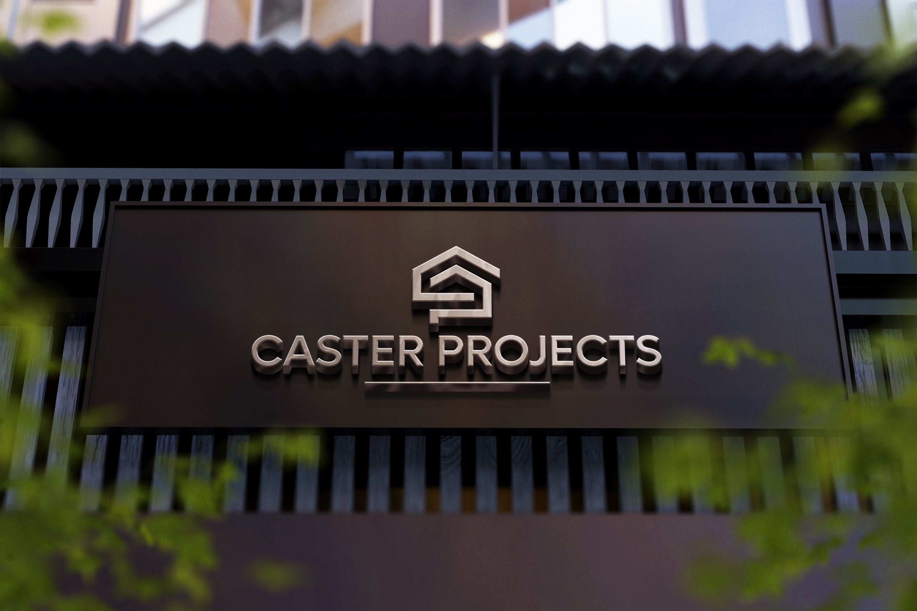
Construction marks an important sector that contributes greatly to the economic growth of a nation. The company was formed with a primary focus to provide a mechanized and robust solution in civil, electrical, mechanical, and IT-related works for strategic projects and technically challenging solutions. It believes in executing several jobs with tight timelines and budgets. It also believes in putting together a team of technically competent and motivated front-line associates to deliver speedy and industry-best results.
It is the Combination Mark Logo, with C and P letters Initials that tell a story about the organization that creates a memorable visual of the brand. with all over-representation of the house-like structure. It signifies growth and offers wider flexibility for branding, and perfectness for new businesses.
The bright orange color highlights the independence, creativity, mastery, and magic as well as spirituality, royalty, and wealthful nature of its business. It shows optimism and professionalism, also idolizes the humble, kind ad strong bond of the customers with the industry. It highlights the social network associated with different business perspectives. It is generally used by industry to bring passion and energy to the business giving the devotion to work.
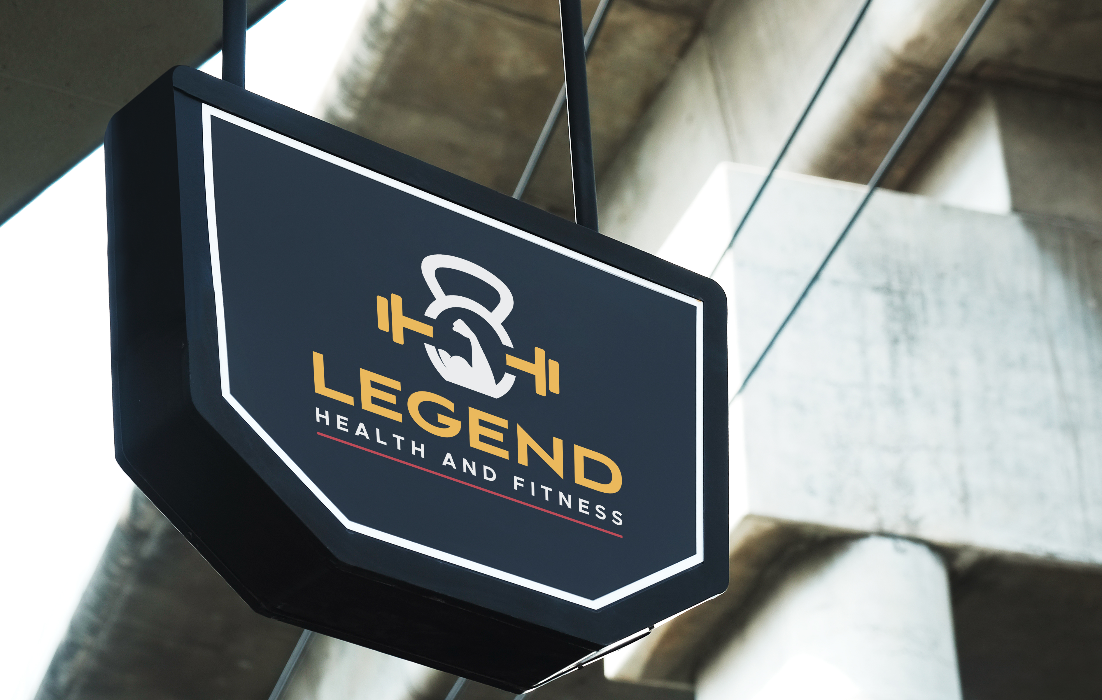
When we feel to make our appearance looks fit and fine, then switch us to the Gym and exercises, which can boost our confidence. The benefits of gyms are numerous as it helps to increase cardiovascular fitness, stronger muscles, better mood, along with stronger bones, more flexibility, increased longevity, decreased weight, and improved appearance.
The given type is the Iconic Logo with unique muscles, Kettlebell, and dumbles, which represent the path of a healthy lifestyle, overlook this aspect of lifting and fitness, which gives a better feel and tends to bring strength and confidence at a higher level. It signifies Intermuscular coordination and stabilizes joint motion. It symbolizes the process of organizing people or groups so that they work together properly. It shows the harmonious functioning of parts for effective results. It also shows the result of excellent coordination between the industry and customers.
The use of Bright yellow grabs attention, and it highlights enthusiasm and enlightenment of the company or brand that brings the passion with stability. It shows the optimistic way that brings success and prosperity in hundredfold. It is associated with warmth, sunshine, and positivity. It is usually aligned with marketing products on a priority basis.

An apartment refers to a room or a living place designed to function as an independent living space. It accommodates multiple households. It helps to become more decisive about major issues of life, like managing the budget, health, and wellbeing, and taking charge of the space. It helps to save money for a longer period.
It is the type of Iconic Logo that represents houses and building in a minimalistic and elegant way. It represents the industry in a most innovative manner, that embraces the new technologies.
It shows managing all the work finely and skillfully that brings development and prosperity in hundredfold, that represents innovation and efficiency to the industry, improving some of the most important stages of projects and construction.
The use of Luxurious color highlights the royalty, loyalty, courage, and magic to the nature of the industry. It helps to move towards harmony with success.
It also represents the warmth and emotions of the customers that associate themselves with the services provided. It marks the perfectness in the services that satisfy the needs of its customers and satisfy them.
Submit Design
Height and Width should be the same (e.g. 1000 x 1000)
Supported file formats : .JPG / .JEPG / .PNG

Submitting...
Submit Design