Notifications
Logout
Are you sure want to logout?
Yes
No
Notifications


Full Name
Enter full name
Contact Number
Enter contact number
Enter valid contact number
Email Address
Enter email address
Enter valid email address

9 May 2022
9 May 2022
Any company, organization, or brand keeps the logo at the apex of all the other things. It is the first point of sharing the thoughts of any brand with its target audience. It acts as the soul of any brand.
So it is very important to keep in mind that the logo should truly represent the identity, values, and prosperity of any organization; which would help the customers to get connected with the company easily.
As certain aspects go with the logo designs, so they get changed depending on the business.
In this blog, let us check the concept of 9 Logos, that highlight their uniqueness from the font, color, infrastructure, and design style. Let us also have a glimpse at its attributes that assigns it status to be placed on a particular level.
Food Business marks its importance in being trendy in almost all the areas.
It is growing rapidly with most of the restaurants and hotels. Restaurants and Hotels in Kerala bring a delicious taste to the customers, which makes their mood delightful.
A smartly designed menu offered at the restaurants makes a significant impact on the customers. The company aims to provide the customers with high-quality food at restaurants at Karakow, which will serve the customers with Kerala food, and target all Indian food lovers.
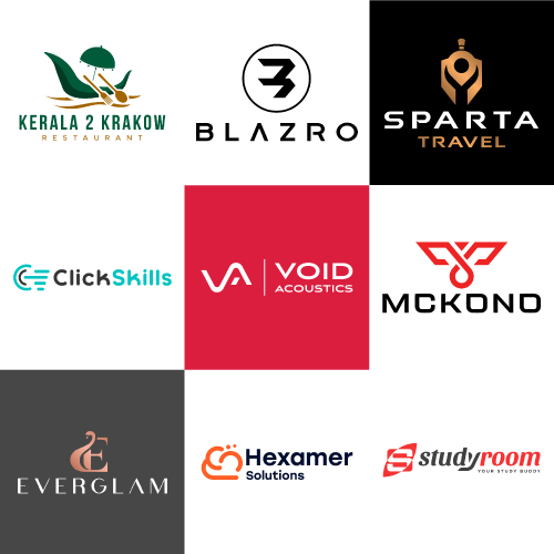
Kerala 2 Karakow is the type of Iconic Logo. The given design represents the spoon, fork, and Boat racing of Kerala, which is considered as the grandest tradition in Kerala. It signifies the restaurant gives a traditional feel, which keeps the customers engaged with its services.
The logo is associated with the Dark Orange color highlights enthusiasm, creativity, and encouragement, and the association of the Green color signifies the freshness and liveliness that shows the natural essence, that gets aligned with the business perspectives and attracts the attention of the customers.
Traveling is considered as one of the best ways to enhance enthusiasm and activeness.
It enables a person to explore and visit newer things different from the daily routine.
Traveling helps us to visit a different part of the world, and makes us relaxed from all the household tensions, and gives a sense of independence, and ultimately is the best option for bringing a healthy and happy life.
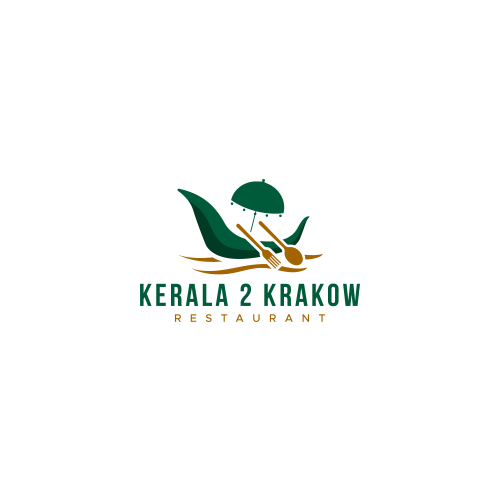
Sparta is the type of Iconic Logo. The design represents a location tag, that signifies the importance of a location tag, which helps to find the destination.
It also shows the uniquely designed Sparta face of Greece, which is famous for its powerful army as well as its battles.
The color denotes royalty, luxury nature, and courage, which attracts the attention of the viewers.
It presents spaces to explore as it has creativity associated with it. Its warm and cool nature brings passion and energy to the business aspects.
Music and sound is considered a crucial part of our life as it gives relaxation to the soul and brings a delightful mood.
It is important because it engages audiences to evoke emotional responses, and also shapes personal behavior.
It is an expression of our culture that brings essence to the life.
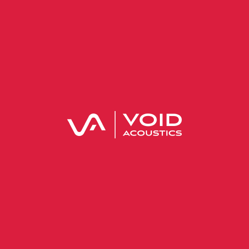
Void is an Initial Based Logo. The design represents the initial - V and A in a unique manner and symbolizes the best efforts taken by the company to approach its customers, which brings a trustworthy feeling.
The colors highlight the determination of the music and sound professionals, to bring essence to the working culture and move ahead towards progress in a unique way.
Designing the logo with an initial letter or monogram is examines an effective method to help people remember the brand services most easily.
The color represents the passion, and joy associated with the functioning of the business.
It promotes a sense of enthusiasm and energy, passion, and warmth, and attracts the attention of the customers.
Mobile cases mark their importance in protecting the whole body of the mobile phone from exterior damage, and some sorts of scratches or nicks that might get onto its body.
The mobile cases are associated with appealing designs, that attract the attention of the customers.
It provides protection, as well as attraction to the eyes of the customers.
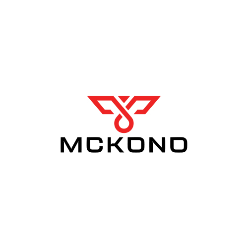
MCKONO is the type of Combination Mark Logo. It shows an Eagle that represents expansion, strength, a higher perspective, loyalty, victory, power, foresight, vision, and manifestation.
Their dominant element of air draws your attention to mental pursuits, inspiration, dreams, and spiritual aspirations.
It also shows a hidden M designed in an exceptional manner.
The colors highlight the passion and high determination associated with the business perspectives.
It also symbolizes the bright vision of the company followed by the path of optimism.
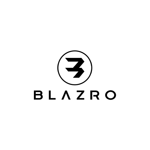
Blazro is the Abstract Initial Logo. The given logo design represents the uniquely designed abstract - B and also shows the whole name of the company in a hidden manner.
It signifies the perfectness associated with the electric vehicles that satisfy the customers needs, and escalates the business in hundredfold.
It indicates that optimism increases the network of the business, to approach the target customers realistically.
The signifies the superiority of the company in the finest way.
The color symbolizes the industry is enthusiastic to achieve its goals and can communicate with its customers in a precise manner.
The elegant colors highlight the positive side, its commonly associated with power and elegance.
It denotes the optimism associated with the company, which shows the balancing nature in fortune and misfortune, which ultimately helps the customers to create trust and reliability.
Makeup marks its attribute in being used as a beauty aid which helps build up the self esteem and confidence of an individual.
It makes many people look attractive and young, with its different products, such as creams, lipstick, perfumes, eye shadows, nail polishes, hair sprays, and many more.
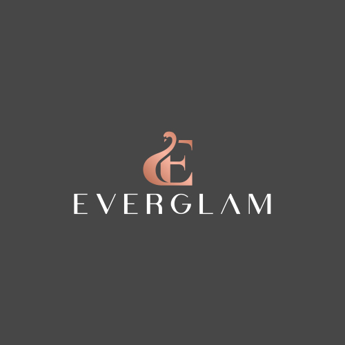
Everglam is the type of Combination Mark Logo. It represents - E with Swan, which signifies that the cosmetic products provided by the company bring shining and softness to the face of the customers making them look beautiful. The colors highlight the smart and creative nature of the business.
A combination mark is simply a logotype and logomark combined into one design.
It combines the text and images to enhance the branding message, and help what a business is all about.
It helps to convey the story about the organization that helps in creating a memorable visual of the brand.
The colors highlights happiness, and optimism that brings enlightenment and creativity to the work, and allures with its illuminating essence. Prominently, it is recognized as a cheerful and lively hue, that gives positivity in every perspective. It conveys happiness, excitement, and enthusiasm. It helps to escalate the industry to the pavement of success.
The information technology sector marks its importance in helping to build and grow the commerce and business sector and bring maximum possible output.
With the advancement of information technology, the business sectors have transformed their outlook and have adopted a modern way, which helps them to grow their business in hundredfold.
IT sector has also established faster communication, maintains electronic storage and provides protection to records.
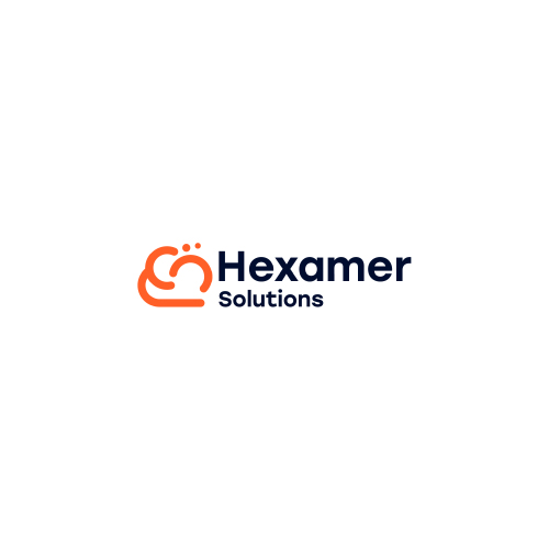
The given type is the Abstract Iconic Logo. The design represents the technological vision of the industry with a clear, simple picture in a precise manner.
It also shows the Clouds with technological nodes that bring innovations and development in technology.
It signifies the business is linked with the prosperity and positivity of the business, which offers the best quality through its services.
The colors highlight the enthusiasm, and balancing nature of the industry.
The colors used allows the company to add freedom and determination along with passion, harmony, and balance to the working environment.
It represents endurance at times of misfortunes and obstacles. It also gives strength to overcome the hindrances aligned in the pavement of progress.

Online education marks its importance in enabling the teacher and the student to set their own learning space.
It adds flexibility to the life of teachers as well as students, and also brings a better balance of work and studies.
It enables the teachers to teach, and students to study or teach from anywhere in the world, without any need to commute from one place to another.
Study Room is the type of Initial Logo. The design represents the exceptionally designed initial - S in a sharp, elegant and appealing manner. It shows the space and flexibility provided by the company
The logo design with an initial letter examines the effective method to help people recognize the services associated with the business even after a long time.
After the uprooting of the first initial letter of the brand name, initial logo designs usually include a stylized letter as the logo symbol. This helps to add professionalism to the business.
The color denotes the passion and determination to pursue education with great effort.
It symbolizes the determination, happiness, harmony, success, energy, optimism, and peace associated with the study room, which would uplift the students future.
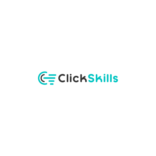
ClickSkills is the type of Initial Based Logo. The given design represents the uniquely designed initial - C with click in sharp, clear and elegant manner.
The initial logo design shows the effective method that help the people to recognize the services associated with the business even after a long time.
After the uprooting of the first initial letter of the brand name, initial logo designs usually include a stylized letter as the symbol.
This helps to add professionalism and optimism to the business nature.
The colors highlights the creativity, hope and stability associated with the nature of the business, which attracts the attention of the customers, and brings prosperity to the nature of the business.
The logo is associated with simplicity, uniqueness, appealing and catchy nature, along with the right color combination makes a design unique to the eyes of the viewers.
It becomes memorable in many perspectives by highlighting some exceptional features to the nature of the work, business and industry.
Submit Design
Height and Width should be the same (e.g. 1000 x 1000)
Supported file formats : .JPG / .JEPG / .PNG

Submitting...
Submit Design