Notifications
Logout
Are you sure want to logout?
Yes
No
Notifications


Full Name
Enter full name
Contact Number
Enter contact number
Enter valid contact number
Email Address
Enter email address
Enter valid email address

7 Jan 2022
7 Jan 2022
Any company, organization, or brand keeps the logo at the apex of all the other things. It is the first point of sharing the thoughts of any brand with its target audience. It acts as the soul of any brand. A brand is nothing without a logo.
So it is very important to keep in mind that the logo should truly represent the identity, values, and prosperity of any organization; which would help the customers to get connected with the company easily.
As certain aspects go with the logo designs, so they get changed depending on the business.
In this blog, let us check the concept of 9 Logos, that highlight their uniqueness from the font, color, infrastructure, and design style. Let us also have a glimpse at its attributes that assigns it status to be placed on a particular level.
When we wish to move to a different place, then the travel services enable us to visit our destined place, but many customers use them as it provides great freedom, which let them explore more and more places happily.
Travel and Hospitality industry mainly includes a broad range of companies, such as railroads, tour operators, travel consolidators, tourist boards, airlines, cruise lines, transportation providers, car rental services, resorts, lodging, restaurants, and other real-estate intensive consumer businesses.
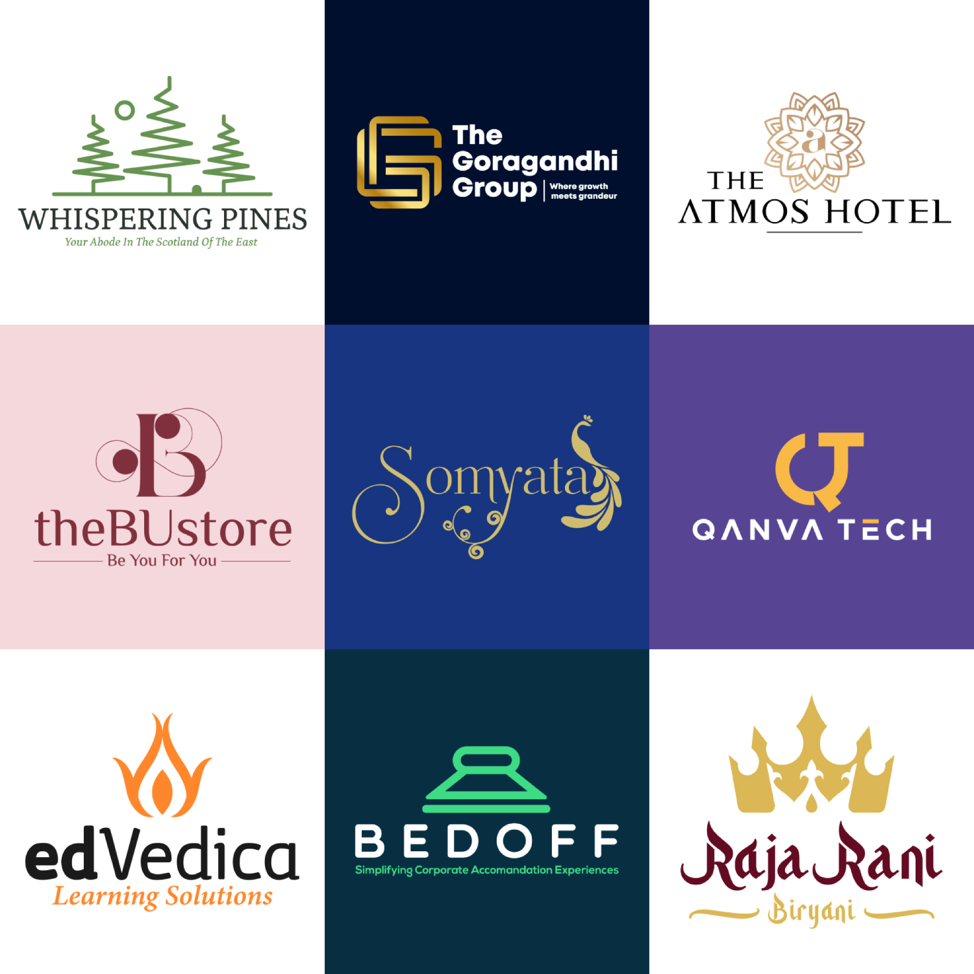
Whispering Pines is a type of Iconic Logo, that represents the sharply and uniquely made Pine Trees, associated with the Sun and a small house in the negative space. It is created in an innovative way to provide essence, sensitivity, and connection of the industry with its customers. This symbolizes the perfection of the industry in terms of professionalism.
The use of Dark Green colors highlights the sensitivity and stability in every situation.
It also highlighted the creativity of industry with determination, which takes it to the height of success. It also indicates the uniqueness of the industry to get engaged with the people fruitfully.
The Fashion related industry long with the colors and fonts, the symbols acts as an extension grasping elements while designing the fashion logos.
These kinds of the industry make the logos that aim for symbols that reflect your taste and resonate with customers who share that taste. On the whole, your symbol, colors, and fonts should all complement each other—to create a fashionable first impression of the brand.
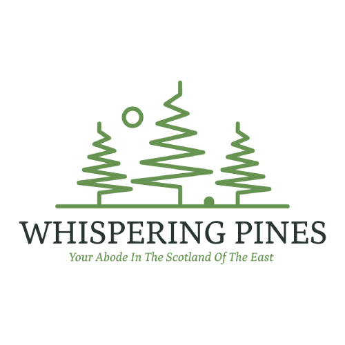
BUstore is a minimalistic, luxury Initial based logo, which is designed uniquely.
This symbolizes the harmony of the industry in a bright and divine way through the hands of the clients. The colors highlight the awakening of knowledge, trust, and wisdom with the group.
A Minimalistic luxury Logo is an exceptionally designed style of a potential logo design. It denotes the phase of the design process, in which the broad outlines of function and form of something are articulated. After fine-tuning, it becomes the face of the business.
The Color denotes royalty, loyalty, luxury, and courage. It presents spaces for new ideas as it has creativity associated with it. Its warm and cool nature brings passion and energy to the work. The colors tend to bring the luxury feel to the business aspects, as it highlights the prominence.
The benefits of the software industry are the speed and accuracy, and the information can be kept in a backup, more quickly and with greater confidence in its accuracy.
This can improve the productivity of employees. It may also improve the movement of goods and the supply of goods to customers.
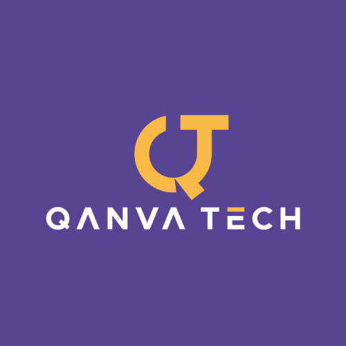
QanvaTech is an Initial Logo designed in a unique manner, which shows the growth of the industry in a forward way. It symbolizes the best efforts taken by the company to approach its customers, which brings a trustworthy feeling.
The colors highlight the determination of the working culture towards progress in a unique way.
The design is a symbol that conveys strong values and ideas that make it immediately recognizable.
It helps the customers to directly understand the services provided by the business. It gives an image to the company in an exclusive form.
The bright color represents the joy and creativity associated with the functioning of the company. It promotes a sense of enthusiasm and energy, passion, and warmth.
It also shows the attributes to recover from the hindrances and disappointments, which enables one to move a bit higher towards success.
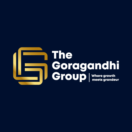
Goragandhi Group represents a luxury Initial based logo, designed in a lineart manner, which indicates the solidity, security, and equal rights provided by the business perspectives to its customers that bring the trust for its customers. It shows uniquely designed - double G overlapping with each other. The logo of any company should be simple and easy to understand because simplicity reflects beauty in a real way.
The logo with an initial letter depicts the effective method to help people remember the brand services most easily.
It extracts the first initial letter of the brand name, initial logo designs usually include a stylized letter appealingly as the logo symbol. This adds spirit to the nature of the business, which brings prosperity hundredfold.
The Luxury Gold personalizes the strength to be royal, self-dependable, organized, thorough, and sensible. This highlights professionalism in every way. They show the positive directions and instructions of the company.
It also symbolizes the bright vision of industry followed by the path of optimism.
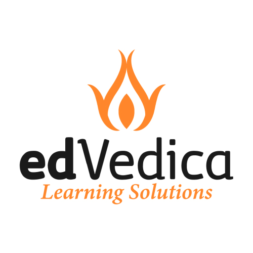
It is the type of Iconic Logo. The design shows the abstract flame of the lamp associated with the floral form, which shows the joining of hands in an exceptional manner.
The design represents the platform greets, welcomes the customers and works in an engaging manner, and aims to bring a smile to their faces through its services. The design is stylized with the Indic essence along with a modern feel.
The colors highlight the prescribed protection and care engaged with the services. represents the joy and creativity associated with the functioning of the platform.
It promotes a sense of enthusiasm and energy, passion, and warmth. It also shows the attributes to recover from the hindrances and disappointments, which enables one to move a bit higher towards success.
The signifies the superiority of the company in the finest way. The color symbolizes the industry is enthusiastic to achieve its goals and can communicate with its customers in a precise manner.
The elegant colors highlight the positive side, its commonly associated with power and elegance. It denotes the honor of the company professionally given to its customers, which helps to create trust and reliability.
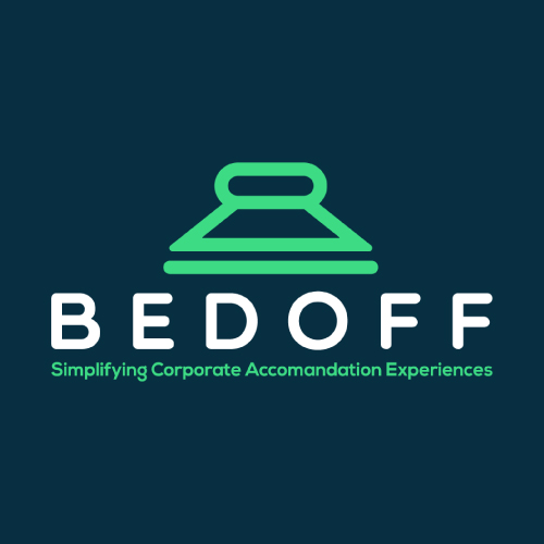
Bedoff shows the Iconic Logo. It represents the uniquely designed rounded fonts, with good color combinations. The design is stylized with elegance and grace, which gives a modern feel. It depicts the prescribed protection and care engaged with the services.
This symbolizes the keenness of the production to walk on the pavement of progress, and get success in hundredfold satisfying all the needs of its customers. It also tends to engage a large number of new customers with the business. The bright colors highlight the creativity of the industry that tends to bring optimism in every way.
An icon is a symbol that conveys superior values and ideas that make it recognizable in an easy way. It helps the customers to directly understand the services provided by the business. It gives an image to the company in an exclusive form.
It shows the colors of happiness and optimism that bring enlightenment and creativity to the work; it allures with its illuminating essence. Prominently, it is recognized as a cheerful and lively hue, that gives positivity in every perspective.
It conveys happiness, excitement, and enthusiasm. It helps to escalate the industry to the pavement of success.
We need a Fashion related industry when we want to make ourselves look good and unique than others, and along with the colors and fonts, the symbols acts as an extension grasping elements while designing the fashion logos.
These kinds of the industry make the logos that aim for symbols that reflect your taste and resonate with customers who share that taste. On the whole, your symbol, colors, and fonts should all complement each other—to create a fashionable first impression of the brand.
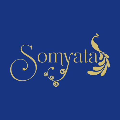
Somyata is a uniquely designed Wordmark Logo with a unique Peacock. The logo consists of a uniquely designed - Y with floral style, which provides it an elegant look.
It signifies the energy to fight from every obstacle ultimately providing the customers, protection in the field of progress. The colors show the optimistic achievement of the industry on the pavement of progress.
Designing the logo with an initial letter or monogram is a simple yet brilliant method that traipses the attention of the customers by giving delightful essence to the business.
By extracting the first initial letter of the brand name, initial logo designs usually include a stylized style of the logo symbol to add beauty simply.
The combination of colors used allows the company to add freedom and determination along with passion, harmony, and balance to the working environment. It represents endurance at times of misfortunes and obstacles.
It also gives strength to overcome the hindrances alined in the pavement of progress.
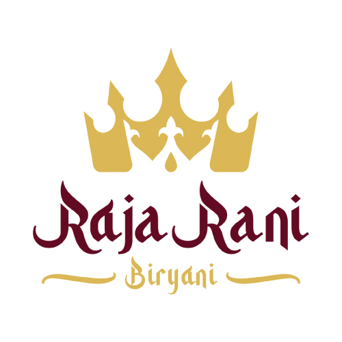
Raja Rani is an Iconic Logo with the crown of King outside, and the crown of the Queen inside a negative space, which shows a unique design appealingly.
It shows the company serves its customers with very delicious taste, which brings a smile to their faces. The colors highlight the mouth-watery taste and flavors associated with the food, which steadily highlights professionalism.
The design signifies the proper connectivity of the company with the interest of the customers, and provides them with the best taste Biryani, satisfying their needs. It highlights the perfectness and exceptionality associated with the industry.
It also indicates the alignment of the company with the interest of customers, which brings progress and achievement hundredfold. The colors highlight the trust, knowledge, and creativity associated with the industry.
The logo is luxurious, and it represents the balancing nature. It symbolizes freshness along with happiness, harmony, success, energy, optimism, youth, peace, serenity.
The media and entertainment industry consists of film, print, radio, and television that include movies, TV shows, radio shows, news, music, newspapers, magazines, and books. So it always looks for a creative and unique logo to target a maximum number of audiences.
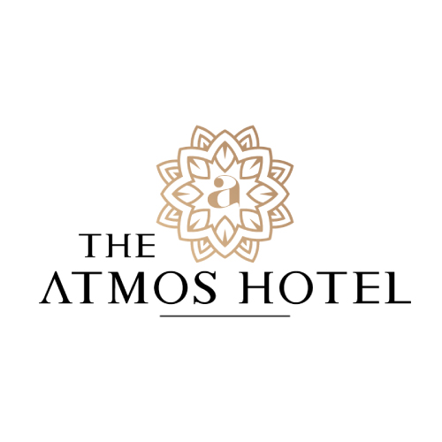
The Atmos Hotel is a type of Combination Mark Logo. It represents the uniquely designed pattern with initial - A, along with the elegant design.
This signifies the brightness of the industry that helps it to move towards advancement, betterment, and growth, along with associating its customers to follow the headway of success to the fullest. The shining colors highlight the full energy and determination of the working nature of the industry.
A combination mark is simply a logotype and logomark combined into one logo. It combines the text and images to enhance the branding message, and help what a business is all about.
It helps to convey the story about the organization that helps in creating a memorable visual of the brand.
The colors show brightful aspects of the industry, which are associated with meanings of joy, warmth, associated with the success of the organization.
It denotes the stability and balance of the industry while facing merits and demerits. It is characterized as sunshine, that spreads creativity to the fullest, satisfying the needs of the target audience.
Submit Design
Height and Width should be the same (e.g. 1000 x 1000)
Supported file formats : .JPG / .JEPG / .PNG

Submitting...
Submit Design