Notifications
Logout
Are you sure want to logout?
Yes
No
Notifications


Full Name
Enter full name
Contact Number
Enter contact number
Enter valid contact number
Email Address
Enter email address
Enter valid email address

11 Apr 2022
11 Apr 2022
Any company, organization, or brand keeps the logo at the apex of all the other things. It is the first point of sharing the thoughts of any brand with its target audience. It acts as the soul of any brand. A brand is nothing without a logo.
So it is very important to keep in mind that the logo should truly represent the identity, values, and prosperity of any organization; which would help the customers to get connected with the company easily.
As certain aspects go with the logo designs, so they get changed depending on the business.
In this blog, let us check the concept of 9 Logos, that highlight their uniqueness from the font, color, infrastructure, and designing style. Let us also have a glimpse at its attributes that assigns it status to be placed on a particular level.
A design studio is a workplace for designers and artisans that get engaged with their innovative ideas and start conceiving, designing, and developing new products or objects.
It allows group thinking rather than one person or group of people deciding on any particular idea, which enables everyone to extensively participate in initial brainstorming to collect as many ideas as possible.
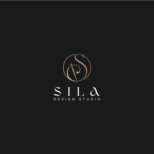
The given logo design is the Combination Mark Logo. The logo design represents the initial S with a needle in a lineart manner.
It also shows luxury and minimal look given to the logo design, which signifies the professionalism associated with the optimism, which escalates the business to the height of success.
The colors highlight the stability, and knowledge of the industry that helps to achieve success. Its warm and cool nature brings passion and energy to the work.
The colors tend to bring a luxury feel to the business aspects, which highlights the positivity and creativity aligned with each other to grow the business.
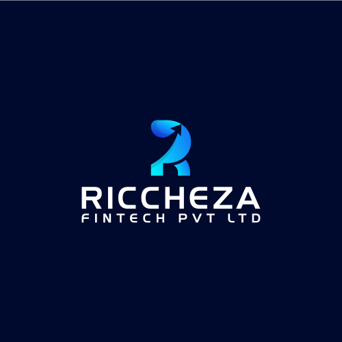
Fintech business has opened a way of possibilities. It offers quality services to the customers, and every business can use fintech for their services and enhance or automate their work and procedures.
Richeza is the type of Initial Based Logo. The logo design represents the Initial R, with a growth arrow, which denotes the company moves forward to bring success.
It symbolizes the wisdom and concentration of the company that helps its customers to get correlated with the environment of the company.
Designing the logo with an initial letter examines an effective method to help people recognize the services associated with the business even after a long time. After the uprooting of the first initial letter of the brand name, initial logo designs usually include a stylized letter as the logo symbol.
The colors highlight the prosperity brought by the efforts of the company, and it represents the balancing nature. It symbolizes freshness along with happiness, harmony, success, energy, optimism, and peace.
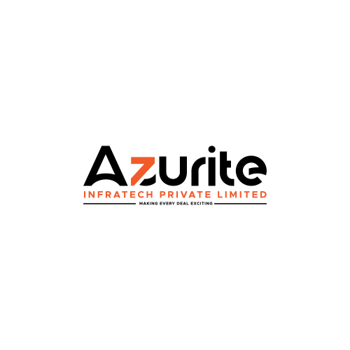
The given logo is the type of Wordmark Logo. The design represents the uniquely designed z associated with the growth arrow.
This signifies positivity and connectivity aligned with the progress, which uplifts the company on the pavement of progress.
The logo design also helps establish name recognition, hence becoming the most suitable choice. These kinds can play a vital role to integrate across multiple platforms like images, colors, and backgrounds.
It communicates the brand personality in a clear and precise manner because every word carries some meaning with it.
The elegant colors highlight the positive side and is commonly associated with power and elegance.
It denotes the honor of the company professionally given to its customers, which helps to create trust and reliability.
It emphasizes the uniqueness that will help to get stuck in the minds of the people for a long time. It helps in bringing versatility to the business and brand.
The Fashion related industry long with colors and fonts, the symbols acts as an extension grasping elements while designing the fashion logos.
These kinds of the industry make the logos that aim for symbols that reflect your taste and resonate with customers who share that taste. On the whole, your symbol, colors, and fonts should all complement each other—to create a fashionable first impression of the brand.
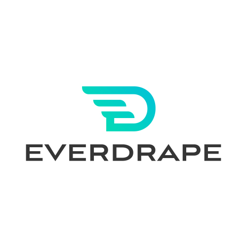
The given logo is the type of Initial Based Logo. The logo design represents the uniquely designed E and D clearly and sharply.
It shows the company moves forward to bring prosperity and growth in business in hundredfold. The colors highlight the progress, harmony, and stability which move the business to the height of success.
It symbolizes the best efforts taken by the company to approach its customers, which brings a trustworthy feeling. The colors highlight the determination of the working culture towards progress in a unique way.
The design shows creativity associated with the functioning of the company. It promotes a sense of enthusiasm and energy, passion, and warmth. It also shows the attributes to recover from hindrances and disappointments, which enables one to move a bit higher towards success.
Food stalls mark their importance in the supply of foods to the customers in a unique manner.
It also allows to supply a much wider range of foods to the customers, which makes them delightful and satisfies their needs.
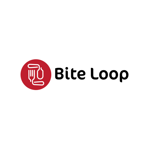
The given type is the Iconic Logo. It shows the uniquely designed spoon, fork, circle, and negative space, which shows an authentic feel of cooking.
This signifies the spirit of the industry personalized realistically, helping the business to grow high at the pavement of progress.
The colors highlight the qualitative creativity with enlightenment.
The colors highlight the stability, and knowledge of the industry that helps to achieve success.
It signifies strong connectivity with progress, trust, and wisdom.
It can be remembered even after a long period, and helps to get recognized among the crowd of competition.
It is versatile and indicate the attribute of it that makes it equally great at all sizes and across all applications.
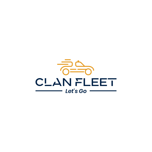
The given type is the Iconic Logo. The design represents the exceptionally designed Taxi in a lineart form. This shows the speed in exceptional which acts as an effective method to keep the people motivated and working for the success of a business.
The vehicle is moving with high speed, and the positivity is aligned with the business, which takes the company to great heights. Taxi services are designed to suit personal transportation needs.
The design also shows car is moving forward with good speed, which shows its main focus in escalating the business to achieve success.
It signifies the strong connectivity with progress, trust, and achievement on the pavement of optimism. The appealing colors highlight the enthusiasm to achieve goals ultimately bringing success.
The signifies the superiority of the company in the finest way. The color symbolizes the industry is enthusiastic to achieve its goals and can communicate with its customers in a precise manner.
The colors highlight the strength to be royal, self-dependable, organized, thorough, and sensible. This highlights professionalism in every way. They show the positive directions and instructions of the company. It also symbolizes the bright vision of industry followed by the path of optimism.
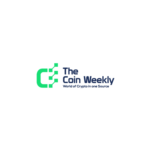
Coin Weekly is a type of Combination Mark Logo.
The logo design represents the Initial C with technological nodes associated with it. It represents the technological nodes with fine roots.
It signifies the high technological mission and vision of the company that helps it to achieve the height of success.
It also shows the determination of the industry to provide qualitative services to its customers.
The colors highlight the stability and inspiration associated with the work.
The colors highlight optimism that brings enlightenment and creativity to the work; it allures with its illuminating essence.
Prominently, it is recognized as a cheerful and lively hue, that gives positivity in every perspective.
It conveys happiness, excitement, and enthusiasm. It helps to escalate the industry to the pavement of success.
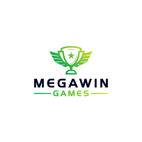
Fantasy Sports are online prediction games where the virtual team of real sports players exists.
It allows earning points based on real-life statistics that later get converted into fantasy points. When the player performs well, then he scores higher fantasy points.
Megawin is the type of Iconic logo. The logo represents the Trophy with wings and star, which is designed exceptionally and clearly.
This indicates the broad and prudent nature of the company that gives quality services to its clients, which helps it to build an idealistic image in the market. The colors highlight the engaging nature of the customers and company which shows its roots in professionalism.
The colors highlight the positivity and optimism associated with high determination along with passion, harmony, and balance to the working environment.
It represents endurance at times of misfortunes and obstacles. It also gives strength to overcome the hindrances aligned in the pavement of progress.
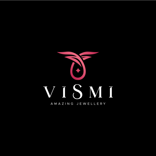
Jewelry marks its attribute in enhancing beauty. It also symbolizes wealth, power, and status.
Jewelry makes the look of the person look attractive and gorgeous.
These are a part of the tradition and culture used by the people often at the times of festivals.
The given logo design is Iconic Luxury Logo. The logo represents the pendent design in a unique and luxury way.
This signifies the positivity associated with the business that helps it to move towards advancement, betterment, and growth, along with associating its customers to follow the headway of success to the fullest.
The colors highlight the full energy and determination of the working nature of the industry.
The colors highlight the stability and balance of the industry.
It is characterized as positivity, that spreads progress to the fullest, satisfying the needs of the target audience.
A logo is a combination of text and imagery part that tells people the name and nature of our business and creates a visual symbol in the minds of the customers that represents the vision.
This helps businesses, industry or brands to build up their identity in the market. When a logo becomes memorable then it differentiates you from everyone else and fosters the loyalty, royalty, and profession of the business.
These logos show the presentation of skills that help create innovative and skillful ideas when the industry comes up with creative and interesting slides to illustrate their talk. Businesses and professional firms use presentations to inform, educate, motivate and persuade internal and external audiences. So it is crucial to have a good presentation to enable a logo to last in the minds of the customers.
Simplicity, uniqueness, appealing and catchy nature, along with the right color combination makes a logo shine in the eyes of the viewers.
These top 9 logos consists of some exceptional attributes by which they could be considered in the list of top 9 logos of the month.
Their wow factor, engaging nature of icons and other elements, like presentation, use of fonts make them an asset of the particular industry to which they belong. They become memorable in many perspectives by highlighting some exceptional features to the nature of the work, business and industry.
Submit Design
Height and Width should be the same (e.g. 1000 x 1000)
Supported file formats : .JPG / .JEPG / .PNG

Submitting...
Submit Design