Notifications
Logout
Are you sure want to logout?
Yes
No
Notifications


Full Name
Enter full name
Contact Number
Enter contact number
Enter valid contact number
Email Address
Enter email address
Enter valid email address

12 Oct 2021
12 Oct 2021
Any company, organization, or brand keeps the logo at the apex of all the other things. It is the first point of sharing the thoughts of any brand with its target audience. It acts as the soul of any brand. A brand is nothing without a logo.
So it is very important to keep in mind that the logo should truly represent the identity, values, and prosperity of any organization; which would help the customers to get connected with the company easily.
As certain aspects go with the logo designs, so they get changed depending on the business.
In this blog, let us check the concept of 9 Logos, that highlight their uniqueness from the font, color, infrastructure, and designing style. Let us also have a glimpse at its attributes that assigns it status to be placed on a particular level.
All of us are aware that we need furniture for our comfortable lives, storage, and relaxation. Buying furniture without being planned, affects your decoration.
Choosing the right furniture for the home or office not only improves overall beauty but also gives peace to the mind keeping the stress away. So decorating furniture always requires a captivating logo that gives a delightful feel.
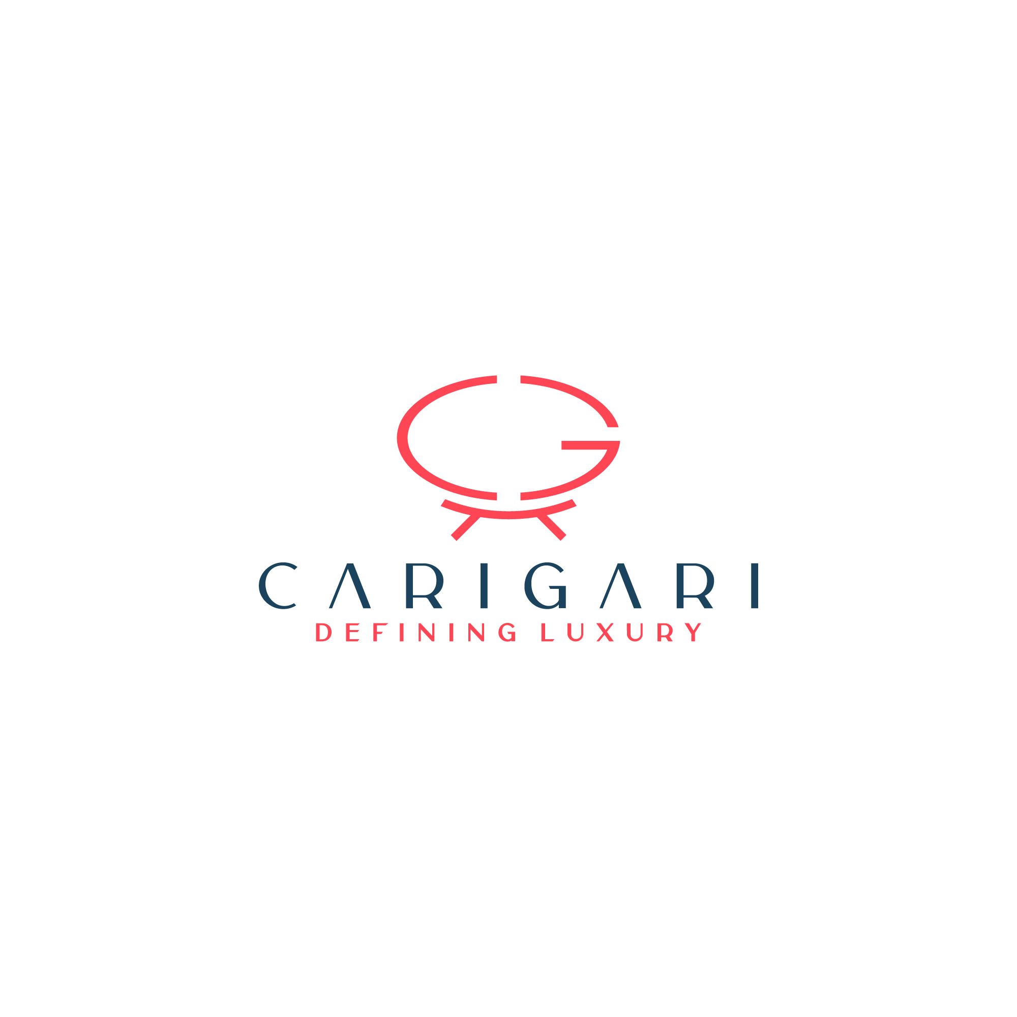
Carigari represents a Conceptual Logo aligned in Lineart form made in Golden Ratio. It is conceptualized with the association of two letters C & G, that are placed on a Lotus Shaped, Two-seater Sofa which belongs to the Royal class.
This indicates the royal essence in every way that adds the optimism and enthusiasm to the work of the organisation.
The letters C & G are filled with the Peach color shows significance by highlighting the feel of comfort, evoking a sense of warmth.
The Navy Blue color used evokes feelings of power and authority, that help the clients to follow up with calmness and serenity.
The Fashion related industry long with the colors and fonts, the symbols acts as an extension grasping elements while designing the fashion logos.
These kinds of the industry make the logos that aim for symbols that reflect your taste and resonate with customers who share that taste. On the whole, your symbol, colors, and fonts should all complement each other—to create a fashionable first impression of the brand.
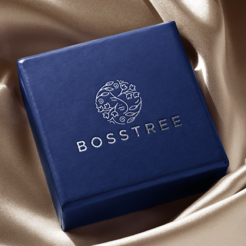
Bosstree is a type of Iconic Luxury Logo. It consists of the face of a lady embedded inside the flowers and leaves. This positively signifies beauty and innocence aligned with progress, which helps to add the charming nature to the business perspective in an attractive way.
A Conceptual Logo is a simple mockup of a potential logo design. It denotes the phase of the design process, in which the broad outlines of function and form of something are articulated. After fine-tuning, it becomes the face of the business.
The Royal Blue Color denotes royalty, loyalty, luxury, and courage. It presents spaces for new ideas as it has creativity associated with it. Its warm and cool nature brings passion and energy to the work.
The colors tends to bring the luxury feel to the business aspects, as it highlights the prominence.
The help-desk services serve as the first, perhaps, the only person responsible for following up the conversation between the company and the consumers. It ensures that various types of information are communicated to users through appropriate sources.
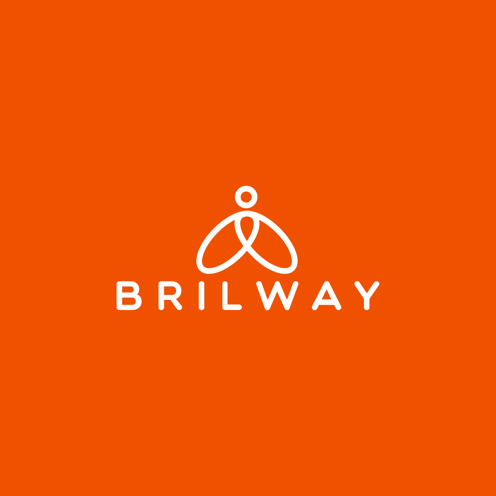
Brillway is an Iconic Help Desk Logo. It has two oval shapes with a person on the top representing the help-desk that indicates the finest communication of the company with its consumers in every situation.
It symbolizes the best efforts taken by the company to approach its customers, which brings a trustworthy feeling. The colors highlight the determination of the working culture towards progress in a unique way.
An icon is a symbol that conveys strong values and ideas that make it immediately recognizable. It helps the customers to directly understand the services provided by the business. It gives an image to the company in an exclusive form.
The Orange color represents the joy and creativity associated with the functioning of the company. It promotes a sense of enthusiasm and energy, passion, and warmth. It also shows the attributes to recover from the hindrances and disappointments, which enables one to move a bit higher towards success.
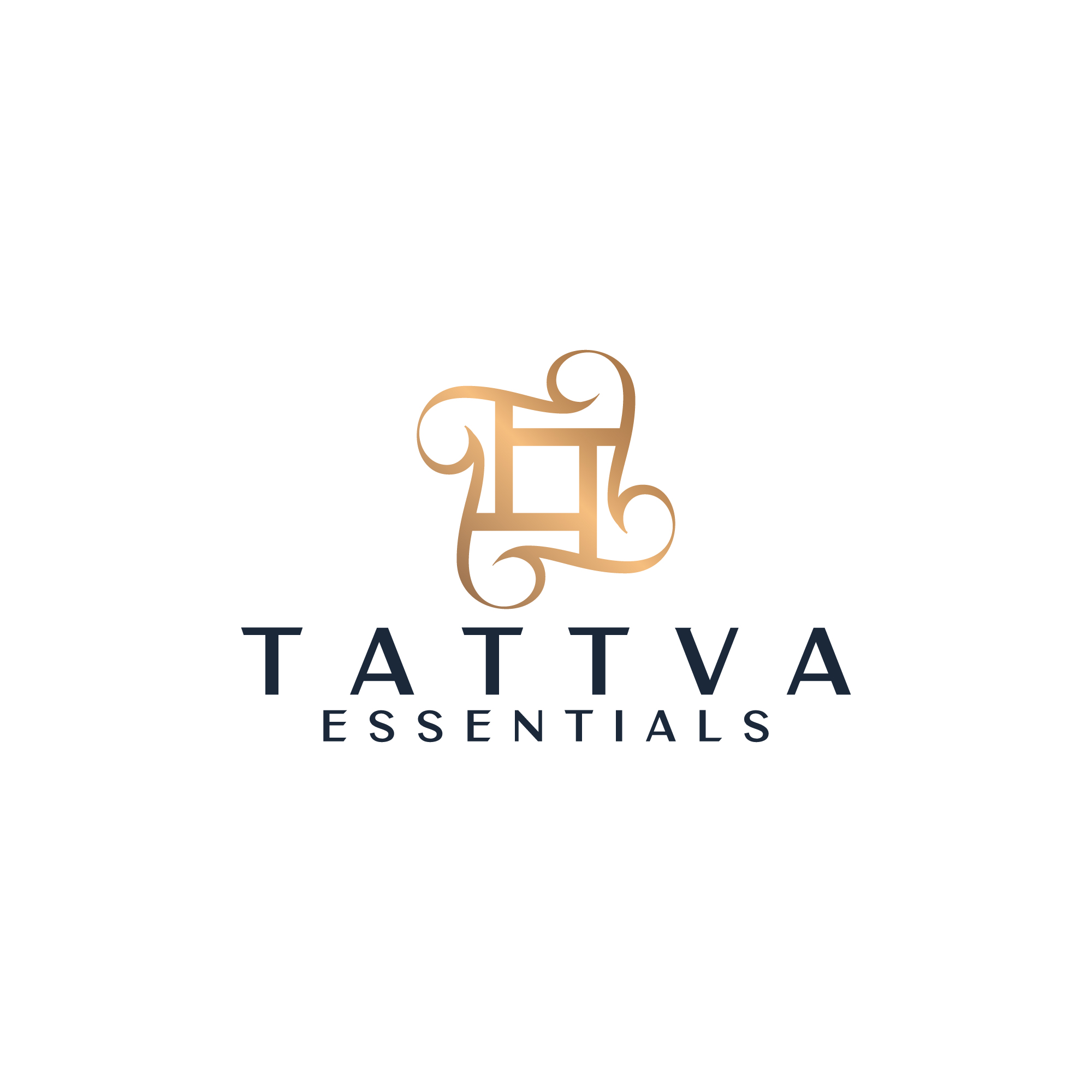
Tattva Essentials shows the Initial Based Logo. It consists of a combination of four Ts placed around the hands of the box, which indicates the solidity, security, and equal rights provided by the business perspectives to its customers that bring the trust for its customers.
The four lines emerging from the box signifies the prosperity and good fortune that highlight the reality. The Luxury Golden color gives the Royal essence to the working culture of the industry.
Designing the logo with an initial letter or monogram is examines the effective method to help people remember the brand services in the easiest way. By extracting the first initial letter of the brand name, initial logo designs usually include a stylized letter in the form of a monogram as the logo symbol. This adds spirit to the business.
The Luxury Gold personalizes the strength of the organisation to be royal, self-dependable, organized, thorough, and sensible without leaving the path of professionalism.
This highlights professionalism in every way. They show the positive directions and instructions of the company. It also symbolizes the bright vision of industry followed by the path of optimism.
Construction is an important sector that contributes greatly to the economic growth of a nation. The Construction Industry is an investment-led sector where the government shows high interest. The Construction Industry is diversified.
It involves numerous clients like property builders, property developers, material suppliers, and contractors. It tends to bring cost-effective building solutions wherein all these clients play a vital role to achieve success. So it always requires a logo that consists of the wow factor.
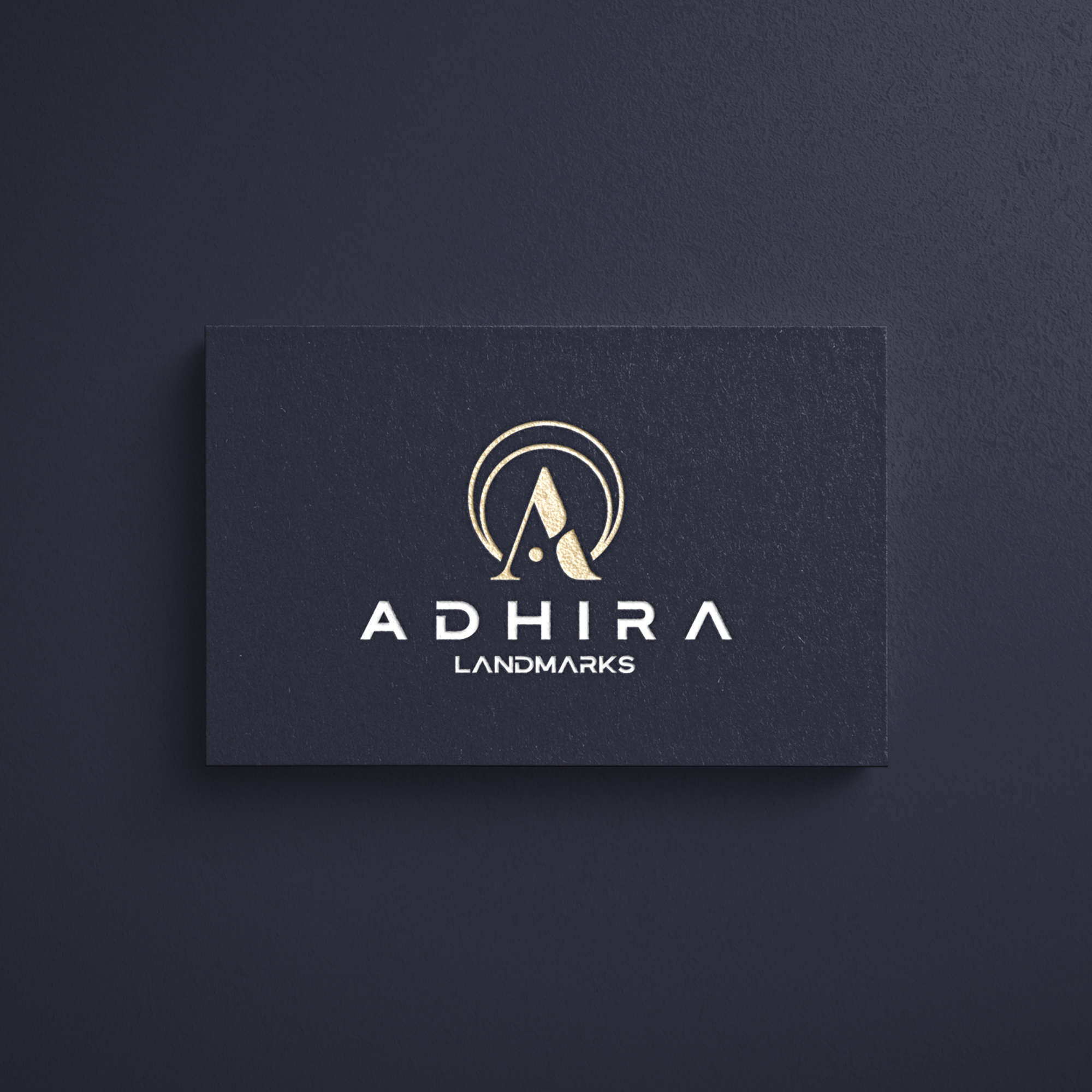
Adhira marks the Initial Luxury Based Logo. This shows a unique A surrounded by a combination of two semicircles, that represents wholeness and original perfection to get recognized in the proper way.
The signifies the superiority of the company in the finest way. The color symbolizes the industry is enthusiastic to achieve its goals and can communicate with its customers in a precise manner.
The elegant colors highlight the positive side, its commonly associated with power and elegance. It denotes the honor of the company given to its customers in a professional way, that helps to create trust and reliability.
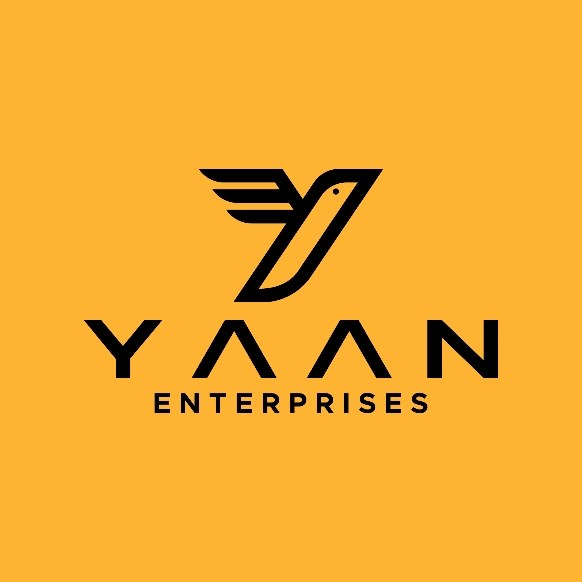
Yaan Enterprises shows the Iconic Logo. It consists of the bird with sharp edges at the corners, and the sharp wings show it is flying straightforwardly.
This symbolizes the keenness of the production to fly high in the sky of progress, and get success in hundredfold satisfying all the needs of its customers. The bright colors highlight the creativity of the industry that tends to bring optimism in every way.
An icon is a symbol that conveys superior values and ideas that make it recognizable in an easy way. It helps the customers to directly understand the services provided by the business. It gives an image to the company in an exclusive form.
It is the color of happiness, and optimism that brings enlightenment and creativity to the work; it allures with its illuminating essence. In a prominent way, it is recognized as a cheerful and lively hue, that gives positivity in every perspective.
It conveys happiness, excitement, and enthusiasm. It helps to escalate the industry to the pavement of success.
The logos associated with the technological sector contains businesses revolving around the manufacturing of electronics, the creation of software, computers, and services relating to information technology. The technology sector offers a wide arrange of products and services for both customers and other businesses.
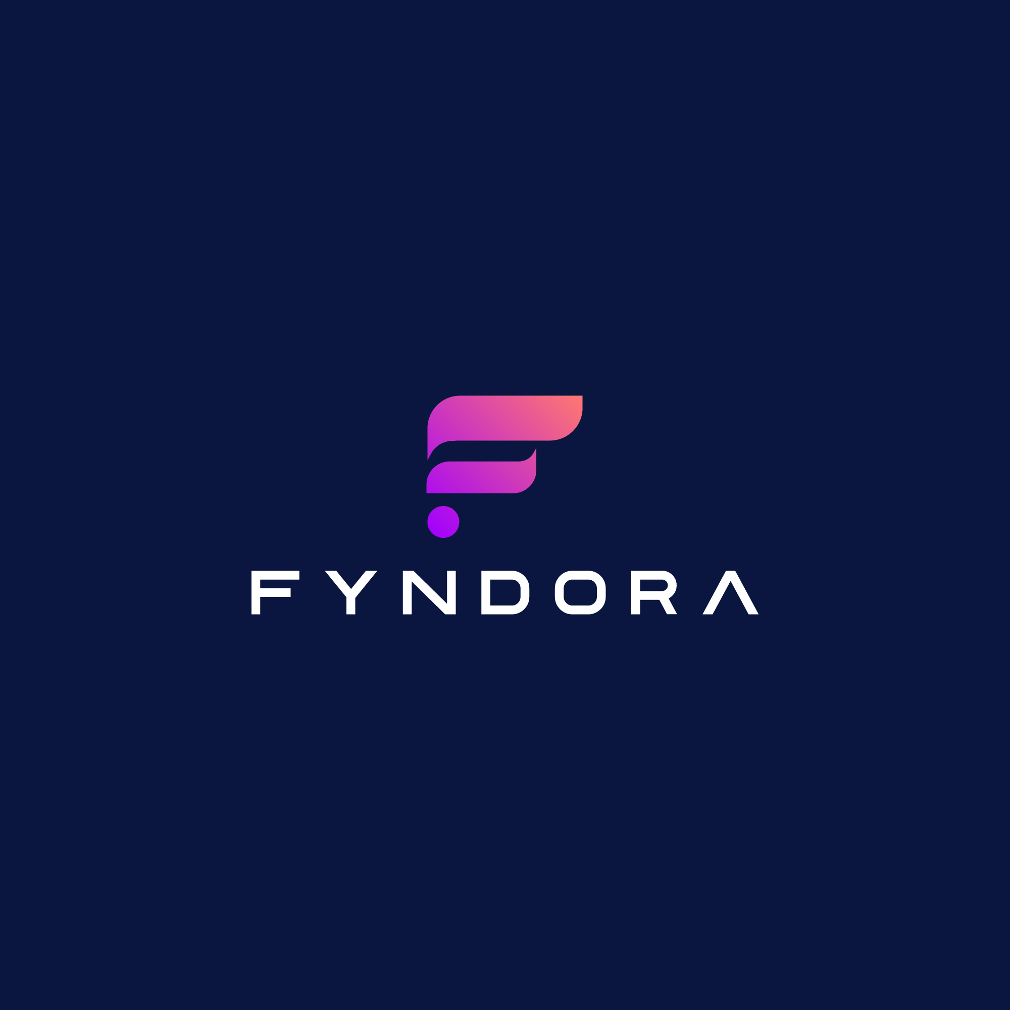
Fyndora is the type of Initial Based Logo. It is made up of a unique F that contains two broad and sharp lines along with a broad dot. This indicates the broad and prudent nature of the industry that gives the technological feel to its clients, which helps it to build an idealistic image in the market. The colors highlight the engaging nature of the customers and company which shows its roots in professionalism.
Designing the logo with an initial letter or monogram is a simple yet brilliant method that traipses the attention of the customers by giving delightful essence to the business.
By extracting the first initial letter of the brand name, initial logo designs usually include a stylized letter in the form of a monogram as the logo symbol to add beauty in a simple manner.
The combination of colors used allows the company to add freedom and determination along with passion, harmony, and balance to the working environment.
It represents endurance at times of misfortunes and obstacles. It also gives strength to overcome the hindrances alined in the pavement of progress.
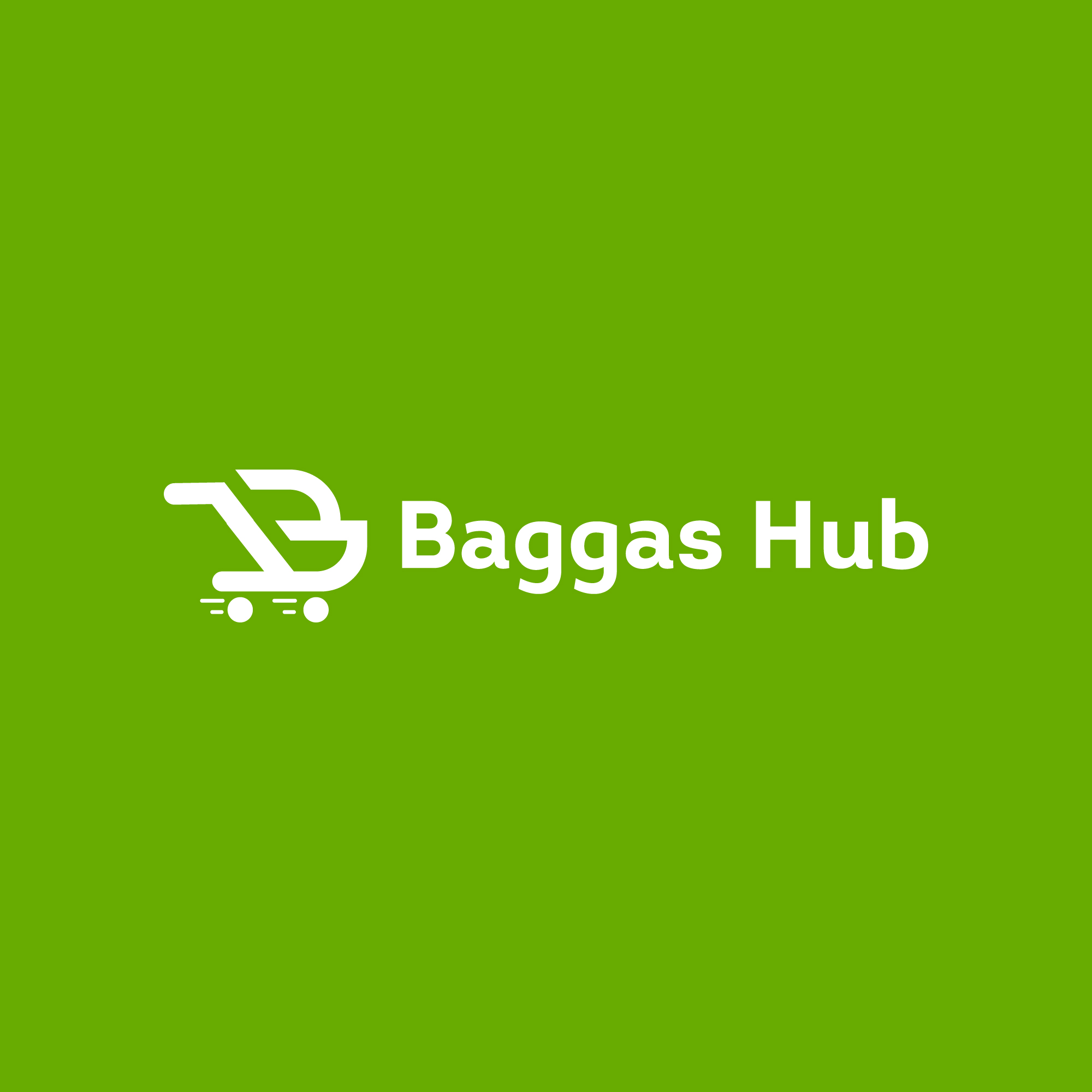
Electronic Company is related to the buying and selling of goods and services, along with the transmitting of funds or data, over an electronic network, i.e. the internet. These business transactions occur either as business-to-business (B2B), business-to-consumer (B2C), consumer-to-consumer, or consumer-to-business. So it requires a logo that should be professional in every aspect satisfying the business.
Baggas Hub is an Initial Based Logo. It is made with a unique B with Cart which denotes the speed of the industry to move forward on the pavement of progress. The wheels associated symbolize the wisdom and concentration of the company that helps its customers to get correlated with the environment of the organisation.
Designing the logo with an initial letter or monogram is examines the effective method to help people recognize the services associated with the business even after a long time.
After the uprooting of the first initial letter of the brand name, initial logo designs usually include a stylized letter in the form of a monogram as the logo symbol. This helps to add professionalism to the business.
The fresh Green color denotes the financial prosperity brought by the efforts of the company. It is a color the color is reminiscent of nature, it is natural, and it represents the balancing nature. It symbolizes freshness along with happiness, harmony, success, energy, optimism, youth, peace, serenity.
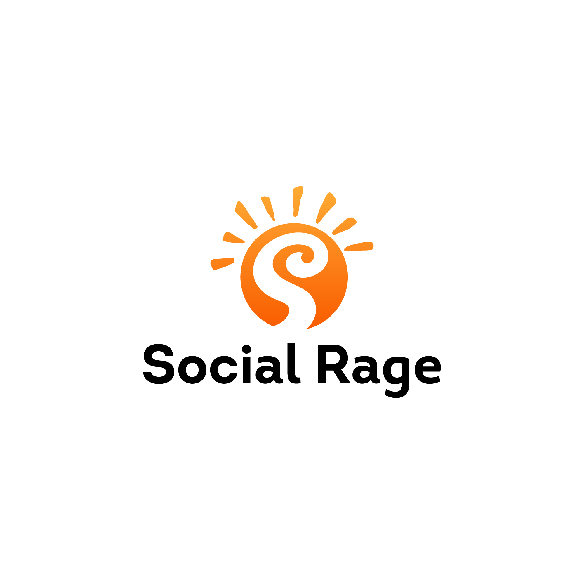
The media and entertainment industry consists of film, print, radio, and television that include movies, TV shows, radio shows, news, music, newspapers, magazines, and books. So it always looks for a creative and unique logo to target a maximum number of audiences.
Social Rage is a type of Combination Mark Logo. It is formed with the unique S letter surrounded by the Sun rays. This signifies the brightness of the industry that helps it to move towards advancement, betterment, and growth, along with associating its customers to follow the headway of success to the fullest. The shining colors highlight the full energy and determination of the working nature of the industry.
A combination mark is simply a logotype and logomark combined into one logo. It combines the text and images to enhance the branding message, and help what a business is all about. It helps to convey the story about the organization that helps in creating a memorable visual of the brand.
Orange is associated with meanings of joy, warmth, associated with the success of the organization. It denotes the stability and balance of the industry while facing merits and demerits. It is characterized as sunshine, that spreads creativity to the fullest, satisfying the needs of the target audience.
A logo is a combination of text and imagery part that tells people the name and nature of our business and creates a visual symbol in the minds of the customers that represents the vision.
This helps businesses, industry or brands to build up their identity in the market. When a logo becomes memorable then it differentiates you from everyone else and fosters the loyalty, royalty, and profession of the business.
These logos show the presentation of skills that help create innovative and skillful ideas when the industry comes up with creative and interesting slides to illustrate their talk. Businesses and professional firms use presentations to inform, educate, motivate and persuade internal and external audiences. So it is crucial to have a good presentation to enable a logo to last in the minds of the customers.
Simplicity, uniqueness, appealing and catchy nature, along with the right color combination makes a logo shine in the eyes of the viewers.
These top 9 logos consists of some exceptional attributes by which they could be considered in the list of top 9 logos of the month.
Their wow factor, engaging nature of icons and other elements, like presentation, use of fonts make them an asset of the particular industry to which they belong. They become memorable in many perspectives by highlighting some exceptional features to the nature of the work, business and industry.
Submit Design
Height and Width should be the same (e.g. 1000 x 1000)
Supported file formats : .JPG / .JEPG / .PNG

Submitting...
Submit Design