Notifications
Logout
Are you sure want to logout?
Yes
No
Notifications


Full Name
Enter full name
Contact Number
Enter contact number
Enter valid contact number
Email Address
Enter email address
Enter valid email address

12 Mar 2022
12 Mar 2022
A non-vegetarian diet has several benefits as it is associated with rich protein and Vitamin B, which helps to strengthen our muscles and ultimately helps them to grow faster.
When people go to restaurants then they make memories with their family members. Restaurants play a crucial role in gathering communities, which brings happiness and enjoyment.
Desi Fried Chicken Logo represents an Abstract Iconic Logo designed creatively. It is conceptualized with the association of vintage look, which is clean and elegant.
The logo represents the professionalism and creativity associated with the work that traipses the interest of the customers with satisfaction. It shows the optimism and taste associated with the business perspective.
The Logo is associated with Red color that shows significance by highlighting the feel of power, comfort, evoking a sense of warmth.
This brings life, joy, and youthfulness to the fullest, ultimately reflecting happiness in the surrounding area.
The Dark Grey color is the color of intellect and compromise. It is a diplomatic color, that is negotiating all the distance between black and white colors.
A watch marks its importance in making us feel confident, comfortable and ultimately build up confidence.
It makes us punctual and possesses great worthful values. Fashion goes hand in hand with the watch.
The given logo represents the Iconic Logo. It is designed in a unique way to express specific things about the brand.
This presents the efforts of an organization in a beautiful way, which would attract a large audience with its artistic creativity.
It states an impressive feeling and has a glimpse of professionalism that gives a background to any organization.
The given logo represents the uniquely designed abstract Eagle luxuriously, showing excellence in design. It is designed sharply that give an artistic feel. It is compatible with the brands and brings reputation, soothing and beautiful feeling.
The design highlights the confidence of the industry, reliability, and responsibility. It relates to trust, honesty, and dependability, therefore helping to build customer loyalty with the product or brand.
It signifies the one-to-one communication of the industry with its customers. It shows wisdom and higher ideals of the industry and is also conservative and predictable.
Portable bathroom sanitation marks its importance in preventing germs from spreading, which protects people from getting sick. Portable toilets are placed at many places and are also used at many functions, including parades, picnics, and other outdoor events.
The given Logo is the Iconic Logo. It states an impressive feeling. It has a memorable and long-lasting impact on the mind of a person. These are compatible with the brands that want to show themselves as reputable and traditional.
It shows an abstract person, with hygiene and plays a significant role in designing and acts as an important part in the designing space.
It holds the design together, and also aligns the object of the design, and brings it into focus. It tends to provide the customers with a proper solution and help them to solve all their queries.
The colors in the given logo show its attribute to evoke peace and happiness, and also highlight the enthusiasm and enlightenment of the company or brand to bring solutions with passion and stability.
In practical terms, it highlights the silver lining of a cloud that removes the crestfallen nature. The design is associated with warmth, sunshine, and positivity.
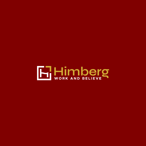
Himberg is the Combination Mark Logo that speaks about versatility. It is quite clear to the audience which does not require any guessing.
It has great benefits as it gives a professional and high standard look and makes effective designs in it to highlight the brand of the organization.
It represents the initial H clearly and uniquely. It is purity, enlightenment, self-regeneration, and prosperity.
It shows the power, legitimacy, victory, triumph, honor, and glory of the industry that satisfies the needs of its customers by delivering high quality.
The luxury color highlights illumination, care, compassion, courage, passion, magic, and wisdom of the industry with its customers helps in an escalation of the prosperity of the industry in hundredfold.
It shows the attribute to evoke peace and happiness, and also highlight the enthusiasm and enlightenment of the company or brand to bring solutions with passion and stability.
Hair week brings good look to our face, and also brings self-confidence which is important to everyone. The condition of our hair has a significant impact on us, like how we view ourselves. Healthy hair indicates that we have enough vitamins and nutrients that ensure the body is operating at its peak condition.
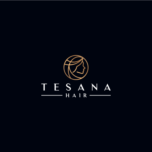
The given logo is the type of Luxury Iconic logo with a uniquely designed abstract lady in a lineart manner.
This signifies the step taken by the industry to provide a better look with the service to its customers in a professional manner, that brings enlightenment.
It symbolizes the eternity of the industry to get the customers associated with prosperity. It also shows increasing strength, performing specific movements, and designs that help to build strength and endurance.
The colors highlight the cheerful efforts of the industry. The industry grabs the attention of the people with the help of these inspiring colors because the colors speak their language.
It evokes calm emotional responses, which are conducive to establishing the trust needed to start just such an ongoing professional and personal relationship.
It signifies luxury nature and depicts hope, renewal, and revival of the industry at times of misfortunes. It also represents nourishments, good spirit, and hope.
SaaS marks its importance in providing notable savings for several different reasons. It also eliminates the upfront cost of purchase or installation, as well as ongoing costs like maintenance and upgrades. These can be easily downloaded and maintained, without spending large amounts of money on hardware installations.
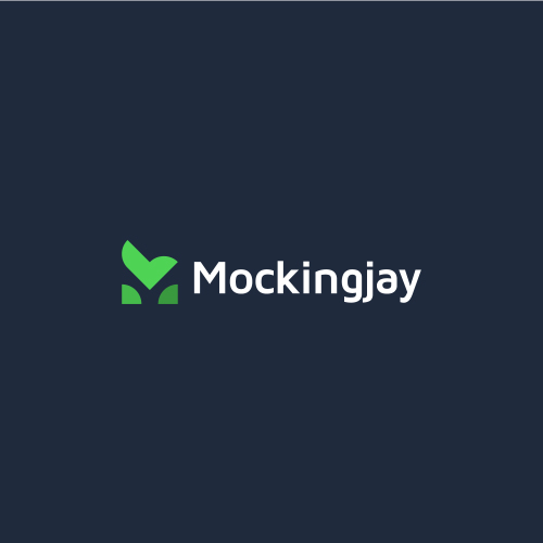
It is the Combination Mark Logo that includes a combination of sharp designs.
The allover design of logo M and Bird flying high to achieve success. It associates the name of the industry with creativity and power; so the customers will get a direct point of view about the brand. It is attractive and easy to remember.
The color sparks bright responses and energetic feelings. It evokes happy feelings and energizing feelings for clients in the business.
This color is most relevant and standard to the industry and its customers. The design helps a business to stand out from others by highlighting its nature that helps pull the customers on the path of satisfaction. It is the one that appealingly welcomes the customers.

A domain name marks its importance in providing the business instant credibility and puts us in the same online marketplace as our largest competitors.
It says that the business helps online shoppers and customers see us as a forward-thinking company that is conveniently accessible online.
The IP address marks its importance to handle the connection between devices that send and receive information across a network. It uniquely identifies every device on the internet. It forms a bridge between computing devices and websites also streaming services.
It is the Wordmark Logo, which shows the uniquely designed Y in the form of slash that represents the business nature clearly. It signifies growth and offers wider flexibility for business and perfectness for new businesses.
It signifies confidence of mind or manner, easy freedom from self-doubt or uncertainty spoke with assurance about the plans, and excessive self-confidence as well. It also shows the trustworthy nature of the business that brings more customers.
The design highlights the independence, creativity, mastery, and magic as well as spirituality, royalty, and wealthful nature of its business.
The colors show optimism and professionalism, also idolize the humble, kind ad strong bond of the customers with the industry. It highlights the social network associated with different business perspectives. It is generally used by industry to bring passion and energy to the business giving the devotion to work.
The Fashion related industry long with the colors and fonts, the symbols acts as an extension grasping elements while designing the fashion logos.
These kinds of the industry make the logos that aim for symbols that reflect your taste and resonate with customers who share that taste.
On the whole, your symbol, colors, and fonts should all complement each other—to create a fashionable first impression of the brand.
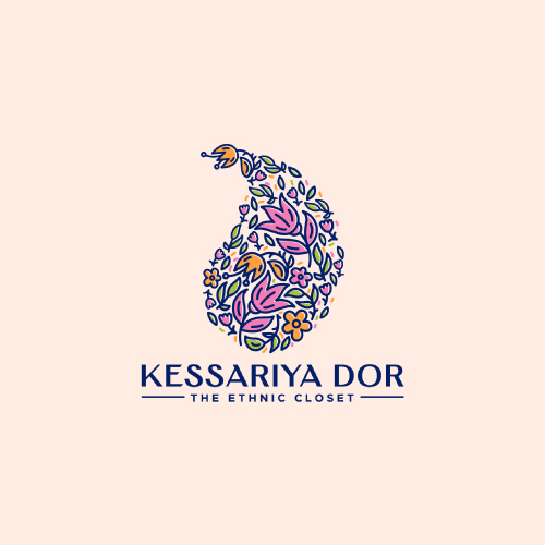
The given type is the Iconic Logo, which represents the ethnic feel with the association of motif, floral designs. It also shows the result of excellent coordination between the company and customers.
The design grabs attention, and it highlights the enthusiasm and enlightenment of the company or brand that brings the passion with stability.
It shows the optimistic way that brings success and prosperity in hundredfold. It is associated with warmth and positivity. It is usually aligned with marketing products on a priority basis.
Gold business marks its importance in not only being valued as an ornament but also as the metal which is the most popular form of investment. Most of the families treasure gold for ages passing it on from one generation to another as a form of asset.
Electronic devices have become an important part of our day-to-day life. It is very difficult to do work without the use of electronic devices. We live in a generation that uses electronics and technologies where robots and artificial intelligence are capable of doing human work with more ease and efficiency.
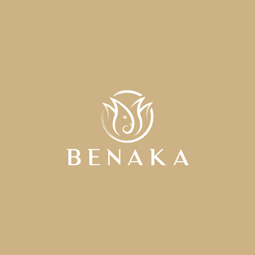
The given type is the Iconic Logo. The design represents the Tulip with lord Ganesha, associated with luxury colors. This shows the main focus of the company in providing proper services, which signifies the strong connectivity with progress, trust, and protection included in the industry. The appealing colors highlight the assurance given by the industry to give protection in every situation.
The use of color highlights the royalty, loyalty, courage, and magic to the nature of the industry. It helps to move towards harmony with success.
It also represents the warmth and emotions of the customers that associate themselves with the services provided. It marks the perfectness in the services that satisfy the needs of its customers and satisfy them.
Submit Design
Height and Width should be the same (e.g. 1000 x 1000)
Supported file formats : .JPG / .JEPG / .PNG

Submitting...
Submit Design