Notifications
Logout
Are you sure want to logout?
Yes
No
Notifications


Full Name
Enter full name
Contact Number
Enter contact number
Enter valid contact number
Email Address
Enter email address
Enter valid email address

20 Jan 2022

20 Jan 2022
Color Psychology can be defined as the study to know how colors influence human perception and behavior. But, when this theory is applied to marketing, then we find how these colors can influence the impression or identity of a brand, and how they impact their purchasing decisions.
Yes, shades of Yellow, Orange, Red, Green, Purple, and Blue are all considered an excellent color choice to grab the attention of anyone easily in the business. It creates the vibes in a way that traipses the attention of any individual most fully. This attention helps to escalate the business optimistically. Though it is a website, product, brand, or any other process; a marketer always tries to highlight any service with some inspiring and catchy colors.
The key to creating an attention-grabbing website is to work plenty of white space and contrast into the design. Instead of packing the website with text, graphics, and photographs, the industry must be selective with some bright colors as well.
A clean layout will offer more visual impact than a page consisting crowd of elements. If web pages are busy with any crowd, then nothing will stand out enough to grab the attention of any user.
Whenever any company gets launched in the market, then it firstly understands and deals with color psychology, because it is crucial to the success of the business. They convey what the audience wants from the market and company.
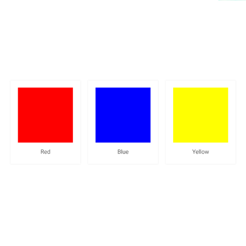
Red
Red color is marked as strong in the market. It is not the most vibrant but has the capacity to seem closer. It has high attraction power to the attention of the people. It also triggers the physical responses and is also seems to highlight enthusiasm, warmth, and energy.
Red color has the power to capture the attention of any person easily. It highlights excitement, passion, danger, energy, and action. Red can be considered as the most intense in terms of color psychology, and also evokes the strongest emotions.
Yellow
Yellow color marks its attribute in attracting the emotion of humans and is considered as the potent emotional stimulator, with its strong wavelength. It highlights positivity in thinking and brings inspiration and confidence. It is believed that it is an inherent feature of things. It is only a phenomenon perceived by our eyes and produced in the brain that creates the images of creativity.
Bright yellow is known for its attribute that is an attention-getter, and it highlights enthusiasm and enlightenment of the company or brand that highlights the passion with stability. In practical terms, it highlights the silver lining of a cloud that removes the crestfallen nature. Yellow is associated with warmth, sunshine, and positivity.
Blue
Understanding color Psychology always helps protect the business, brand, or product in numerous ways. Blue is the most universally favored one of all and therefore the safest to use in terms of business. It relates to trust, honesty, and dependability, therefore helping to build customer loyalty with the product or brand.
Blue indicates the confidence of the industry, reliability, and responsibility. It signifies the one-to-one communication of the industry with its customers. It shows wisdom and higher ideals of the industry and is also conservative and predictable.
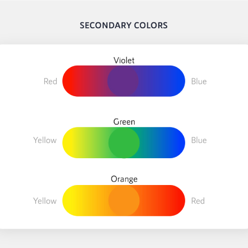
Whenever we mix primary colors, to bring more innovations together, then it brings Purple, Green, and Orange colors.
There also exist some brands that create a separated combination of two colors in a unique way that highlights the brand.
Orange speaks about sparks bright responses and delivers energetic feelings. It is one of the sensible colors which is liked by most people. It evokes happy feelings and energizing feelings for the customers in the market.
This is most relevant to the industry for selling products, highlighting brands, and targeting the emotions of the customers. Orange helps a business to stand out from others by highlighting its nature that helps pull the customers on the path of satisfaction.
It is the one that appealingly welcomes the customers to the business.
Here is how orange is usually used in the design- in the foreground to highlight essential elements, as the main color in the background to reflect feelings.
In terms of color psychology, Green is highly connected to nature and money. It mainly highlights the growth, naturality in the surrounding areas, health, freshness, and generosity, that brings optimism to the business.
The psychology of Purple in marketing is often associated with wisdom, dignity. It attracts the attention of the customers and steals their hearts in a distinctive manner. It tends the market and business towards richness and power.
As a graphic designer, usually highlights the Purple color to show the independence, creativity, mystery, and magic as well as spirituality, royalty, and wealthful nature of its business. A product highlights the color to show optimism over pessimism. It idolizes the humble and kind bond of the customers with the industry.
When we visit different websites, we find many theories of colors that match the brand. It is crucial for any company to understand, which goes best with the brand, product, and services. They need to understand the psychology and the interest of the people. Every brand is different, and the right color depends on the inner content and the interest of the people.
All of the colors share some unique connections. HEX, CMYK, RGB, and PMS are a few of the most common models or matching systems that help connect what our eyes see with the colors we want to present in our materials. It helps to represent our innovative thoughts artistically. They are sets of numbers used to express the combination of color or light appealingly. It attracts the customers to get in touch with the brand, product, or service of the industry.
Pinterest is another platform for appealing advertising, that associates the users with the brands.
This platform is mainly comprised of a female users base.
It is considered a beneficial platform for the e-Commerce industry.
When a person looks for a simple and effective way to share their content on social media sites, then they consider pinning it on Pinterest.
Pinterest is a great platform for promoting blog posts from the business blog and increasing the readership.
It makes it convenient to connect the content and increases the chances so that the blog posts will reach more readers.
Pinterest also provides more access to the posts, which helps to improve the chances of having the content shared.
It offers a level of visual appeal for the users.
Pinterest contains interesting and appealing content to reach potential customers.
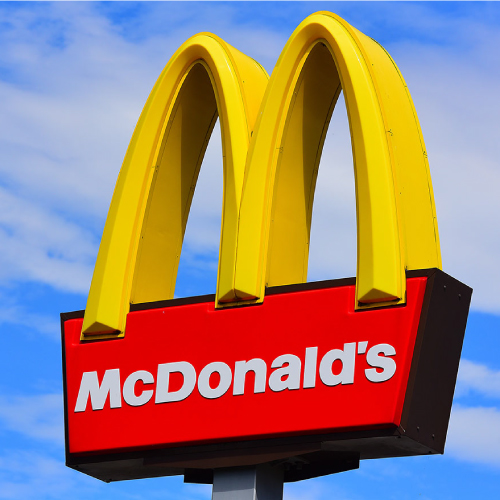
The logo of McDonald is associated with Yellow color. Its logo began its journey in the year 1940.
Stanley Clark Meston innovated a project and created the famous Golden arches, which were stylized images of the restaurant of McDonald.
It attracts the customers with its bright color and makes a positive image in their minds about the brand.
In the year 1961, Ray Crock decided to rebrand, and in 2003 the arches were given a cylindrical shape, and again a small arrow was attached to the cylindrical shape, and a small shadow was again attached to the letter - M.
It is an excellent example of a distinctive design. It is the simple and distinctive one that attracts a wide range of customers towards its business. It has a significant role in creating its brand image. Its famous arches form the part of its design.
It highlights the primary colors, which represent the famous arches of its first franchised restaurant.
It uses the McLawsuit font in its name. It inspires the customers in a great way that everyone looks up to it as a symbol of excellence.
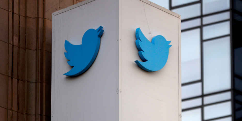
The logo of Twitter is associated with the Blue color, highlighting its presence with stability, and loyalty.
It was named Larry T Bird, with the inspiration being the basketball legend Larry Bird who played for the Bolton Celtics.
This was the time when there arose the image of a bird in the minds of the founders that started its appealing characteristics of habit i.e. the nature of a tweet that indicates quick and short, just like the noises a bird would make.
The bird Icon reflects the essence of purity as Twitter sounds a lot like the tweet, which is a sound made by birds.
Hence, the logo symbolizes freedom and endless possibilities. Short messages are delivered as fast as birds fly, hence the name given.
Starbucks marks its presence with the Green color in the market, making it fresh always, and associating itself with nature.
It attracts more people towards it and has become a great brand.
Starbucks was starting to sell more than just coffee drinks, to expand their business even further by offering their customers more product options.
Today, Starbucks does not only sell coffee but also breakfast foods and tea.
The siren icon of the logo with the Green color has stayed and will always be an important part of the brand identity design.
Its visual identity has always made it stand out from the crowd.
Starbucks has made its stable place in the market making itself a brand by contributing the Coffee brand globally.
It mainly highlights the growth, naturality in the surrounding areas, health, freshness, and generosity, that brings optimism to the business.
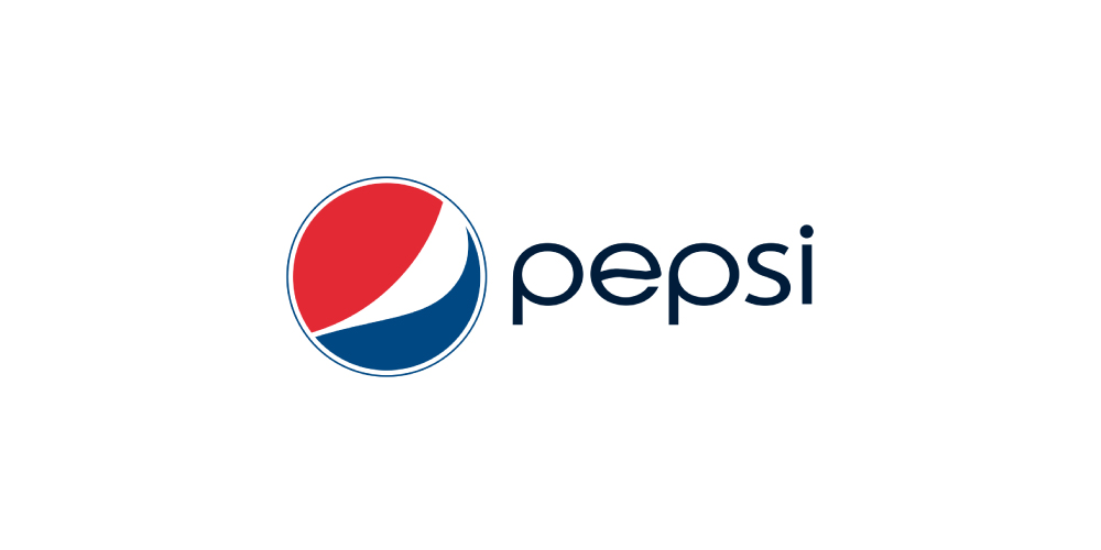
Pepsi dissociated the brand name out of the wavy globe in 1991. The white line of the wavy globe again came up with a narrow shape like the previous logo versions.
It showcases its personality concisely and effectively to its audience. It was simple logos that have an elegant and sharp design with attractive colors associated along with it, which have the power to steal ones heart amusingly.
It does not change its design style and fonts. Rather it took the Red banner element with a more prominent version than in the 70s. It appeared in the italicized font for the audience, and the Red and blue dominated the Pepsi logo, and white made a comeback as a color for backspace.
The brand took the 3D logo to show the differently unique version. Its Blue color became dominant for the first time, which related with the trust, honesty, and helped to build customer loyalty with the product or brand.
It highlighted added the elegant and sharp look by shifting the background to a horizontal gradient to the Pepsi emblem. The typeface got changed to a serif for the first time and associated a blue line with it.
It was filled with the light gray shading within the letters, which helped it to stand out from the crowd as 3D elements as well. It could directly evacuate a place for itself in the heart of any person. When the audience can easily recall the brand, they get more brightly connected by themselves to the brand.
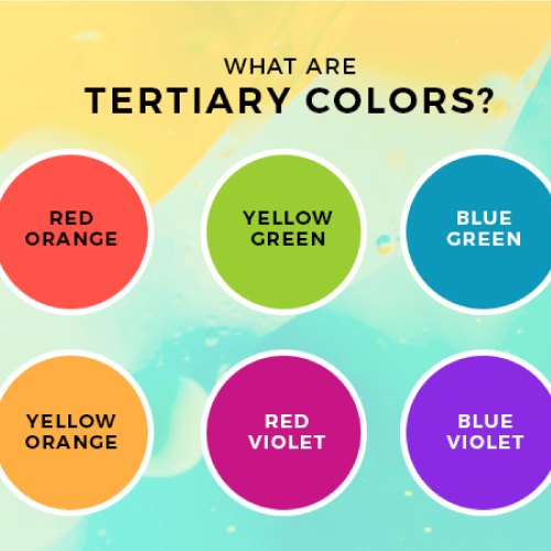
When we mix primary colors in uneven ratios or a primary color with a secondary color, then we get tertiary colors.
The combination of Red and Orange, Yellow and Green, Blue and Green, Yellow and Orange, Red and Violet, Blue and Violet are included in the list of Tertiary Colors.
Its Combination creates an appealing form of design, which marks its presence in the brand logos.
These highlight a different kind of vision when gets associated with the brands, which ultimately helps to escalate the business to the height of success.
The combination tends to bring the attention of maximum number of customers towards it, which helps to increase the productivity, and in prosperity in the business in hundredfold.
As we dig deeper into its visual and mental significance in business, they go beyond appearance and generates an experience.
It offers an instantaneous visual way to associate meaning to a particular company or industry.
The logo of Google firstly marked its presence in the year 1997, with very bright colors.
It was the year 1999 to 2010 when the brand went from evolution. The brand again came up with the final design in one of the most minimal styles.
Its official logo came into existence from the period, 1999 to 2010. And in 2000, it came up with a new style with bright colors and attractive typography.
The industry grabs the attention of the people with the help of these inspiring colors because the colors speak their language.
It is generally used by industry to bring passion and energy to the business giving the devotion to work.
They highlight the determination of the industry to satisfy its customers and ultimately raise the standard of the working culture.
This could also be considered as a powerful form of communication; that not only inspires but also makes a strong bond between customers and industry.
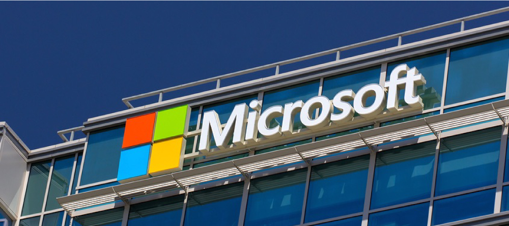
All of us know that Microsoft established itself as one of the most creative software brands. Its operating system, Windows, and the line-up of Office software products highlight the exceptionality of its services.
The image created by the company made it a brand that will last in the minds of the people for a long time.
Microsoft Office 365 consists of a combination of cour colored Squares. This refers to the Iconic logo symbol of Windows.
Its multi-colored part indicates that Microsoft 365 includes a variety of creative concepts interlinked with each other to form an appealing design.
The icon symbolizes the Windows system. The design is simply featured with four window panes of different colors, Red, Green, Blue, and Yellow.
This window version of the logo got personified from the flying windows to a static one. It also emphasizes the innovation of the company in technology, which it offers people daily.
Colors play a crucial role in providing a visual appearance to the products, as well as the brands in the market. The analysis shows that the colors can also communicate the brand personality in terms of marketing.
Marketers always must be aware that which colors can go and suit the particular content or product. There are some attempts that classify the response of the consumer and attract their emotions.
The psychological and emotional effect of color in each person is influenced by experiences, culture, natural environment, and many more.
When they make color decisions, then they mainly focus on the target audience and convey the right message, because the color helps the people to make the decision to purchase the product.
Submit Design
Height and Width should be the same (e.g. 1000 x 1000)
Supported file formats : .JPG / .JEPG / .PNG

Submitting...
Submit Design