Notifications
Logout
Are you sure want to logout?
Yes
No
Notifications


Full Name
Enter full name
Contact Number
Enter contact number
Enter valid contact number
Email Address
Enter email address
Enter valid email address

1 Jan 2022
1 Jan 2022
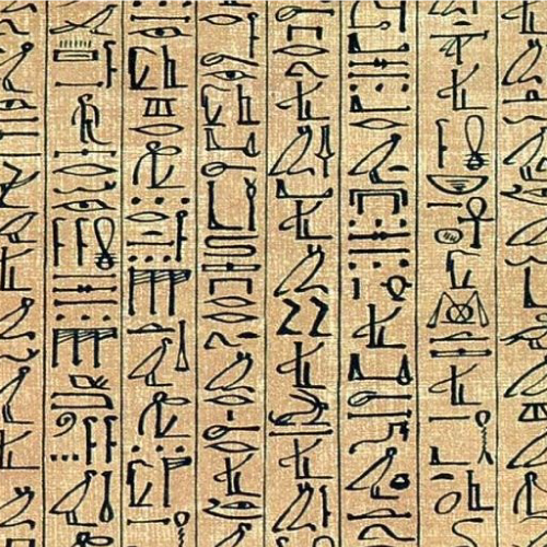
In the previous blog, we have studied the history of ancient logos, which states that the logos are the personification of the symbols. There was a huge increase in mass production in the Victorian era, and also a surge in interest in the credit, that was given for the craftsmanship, leading to the beginning of the logo, and during 1876, the first logo got trademarked for Bass Brewery. William Bass was the founder of the Bass Brewery in 1777. It consisted of the Bass text beneath it, with a Red-colored Triangle. It became the first registered trademark of the UK and took control of several other large breweries in the earlier 20th century.
Let us study that which were the other famous logos after the Bass Brewery. The logo Stella Artois, Twinings Tea, Shell Oil and Levi Strauss & Co., and Coca-Cola are believed to emerge after the Bass Brewery, which was emerged after the year 1876. Along with this, it also faced evolution, for many years. There also evolved some famous after the Bass Brewery.
Stella Artois logo was first used in the year 1366, and Local brewer Sebastian Artois launched the brewery in the year 1708, and also renamed it after him.
The horn that once beckoned travellers in Belgium is prominently featured in the current brand, and it did not get changed even after hundreds of years.
Its tradition began in the era of the 14th century, and it all started with the Den Hoorn brewery located in Leuven, Belgium.
It showed the finalization of the brand, after emerging in the 20th century.
The Stella Artois name is a popularly known and distinctive logo.
It can be considered as a testament to the branding, as it incorporates the traditions and history of the company.
It is distinctive and also recognizable, which lasts in the memory of the customers for a long time.
It became exclusive with the flow of time and lasted in the minds of the people marking its prominence in the world of logos.
Just after the Bass Brewery, there came the Twinings Tea in the year 1887.
It used a logo similar to the capitalized font beneath a lion crest, marking its presence in the oldest and continuously used designs in the world. Simplicity is freedom from extravagance, luxury, and complexity. It is considered a key to attract the maximum number of people.
As simplicity reveals beauty in a precise way; so most of the logos are made simply to attract a great audience.
Wordmarks uniquely show their simplicity, hence considered as the choice of most of the designers favor wordmarks. Any organization does not want its design to look unforgettable, which would lack in communicating the brand identity.
So when a company needs a simple one, then it always goes with the Wordmark, to reveal the beauty through simplicity.
The Twining Tea was featured with a very simple Wordmark. It is one of the oldest and has a timeless logo, which looks royal and enduring.

It was the year 1904 when there came the logo of Shell Oil. A logo becomes memorable when it has a combination of bright colors with it; which enables it to stand out from the crowd.
This creates a strong bright-colored impact which is mandatory because it helps a brand to get stick in the mind of the consumers.
They always strive to be unique. It dictates the personality of the brand and tone in a respectful way.
The Shell Oil is also associated with bright colors, which makes it look more appealing and attractive.
It is an attention-getter, and it highlights enthusiasm and enlightenment of the company or brand that highlights the passion with stability.
In practical terms, it highlights the silver lining of a cloud that removes the crestfallen nature. The colors are associated with warmth, sunshine, and positivity.
Its colors make it more appealing and attractive, which deals with the interest of the customers, and brings them to the brand.
In the year 1886, Levi Strauss & Co came front with the featuring two horses, stood on the fifth position in the list behind Stella Artois, Twinnings Tea, Bass Ale, and Shell.
A logo should be fascinating because a dull design will not fetch the desired results. Colors and letters are two mandatory elements required in any design that helps it to become catchy.
To be attractive, the use of colors should be clever and professional. Contrasting colors and brief wordmarks are the keys to make the design look catchy.
Levi Strauss & Co was a unique logo, and it also attracted the interest of the customers in such a manner, that they used to often ask for those pants with the two horses.
The brand also came up with the name - The Two Horse Brand until 1928.
There also exists a logo, which marks its prominence since 1876, and is still famous.
It went through a lot of changes but has also been famous since it was made.
The logo of Coca-Cola is Iconic and is universally recognizable. It marks its presence in the list of all world-famous logos. As the old things are in good repute, hence Coca-Cola still reputable in the world.
On 8th May 1886, the bookkeeper of Dr. John S Pemberton came up with the name Coca-Cola. Along with this, Robinson brought its creativity on the platform, and designed the logo, which became famous in the world.
It was drawn with a proper flow and was one of the most recognizable trademarks in the world. By writing the name Trademark on the tail of the letter - C of the Coca-Cola, and on January 31, 1893, it was trademarked and became world-famous.
Let us look at the evolution of the prominent brand, with the change of time. It got evolved with the change in time but did not lose its reputation and popularity.
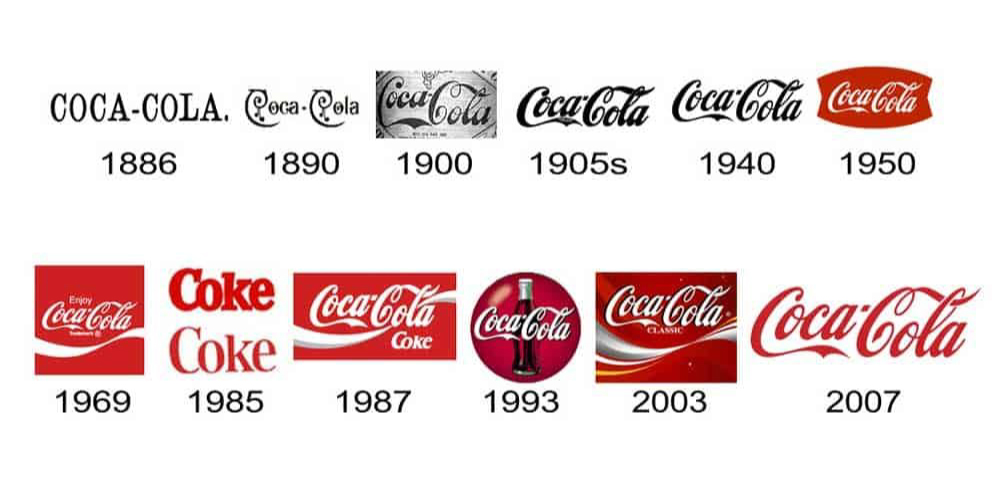
The year 1886 marks the beginning of Coca-Cola, whereas the year 1887 marks the year of the trademark. Trademarking grants startups the security of their brand. By trademarking a company name, one makes its services and products distinctive in terms of its competitors, becoming their intellectual property. It is often advisable to register the trademark to protect it from unauthorized use by someone else. Trademarking grants startups security in the field of branding which leads to escalating the business.
It was the period between 1890 to 1891 when the same brand came up with the swirl transformation, which was appealing and mesmerizing for the customers. The modification of the tail of the Coke was seen between the year 1941-1947, and the phrase trademark registered was removed from the part of the letter - C of the Coca-Cola.
It is crucial to always be unique in the market, by maintaining the brand personality. The personality refers to a set of human attributes that are specified to a brand name. An effective brand increases equity by having a constant set of traits that a specific line of consumer enjoys. As such a brand personality is something to which the consumer can relate.
It helps in accommodating communication with the customers finitely. A customer can relate to the personality traits that enable an emotional connection to get created between the brand and the customer. Hence to maintain its uniqueness in the market Coca-Cola designed the Red Disc (button) symbol to show high creativity.
Between 1958 and 1960, the logo came up with the fishtail. The script was stylized in the shape of the Arciform. Later on, it got discovered in the market with the name Fishtail, and it became very prominent in the market, and also got used in cartoons, copy, and many more.
It was the year 1969 when Coke came up with the White wave and was underlined with the White wave, which is still used in the market, that attracts the interest of the customers.
It also came up with Diet Coke in the year 1982, which was the first expansion of the Coke trademark. It emerged with the white wave embellished with some bubbles, and later on, took the look of one white ribbon which was simple and elegant in look. It was the year 2011 when it came up with its completion of 125 years of anniversary, which shows the bubbles escaping from the contour bottle, which showed a salute to the past, present, and the future.
Between the years 2013 - 2014, the company launched a campaign named to share a coke, which was initially printed in the classic Coca-Cola Spencerian style of writing. Taste the Feeling was an appealing ad campaign, which was brought by the brand. All of its classic flavors got combined inside the traditional Red disc style, and it attracted the attention of the customers towards it.
It was associated with a circular or rectangular shape below the hobble-skirt bottle, and the rectangular style, which is quite simple and uniquely designed with a swirl and a cursive font. Its stylish, distinctive, and appealing design with cursive font, along with the white swirl revive the spirit of youth.
[The images are being taken from the registered companies and belong to their respective owners only.]
Submit Design
Height and Width should be the same (e.g. 1000 x 1000)
Supported file formats : .JPG / .JEPG / .PNG

Submitting...
Submit Design