Notifications
Logout
Are you sure want to logout?
Yes
No
Notifications


Full Name
Enter full name
Contact Number
Enter contact number
Enter valid contact number
Email Address
Enter email address
Enter valid email address

30 Oct 2021
30 Oct 2021
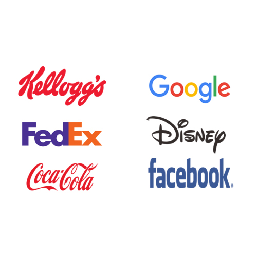
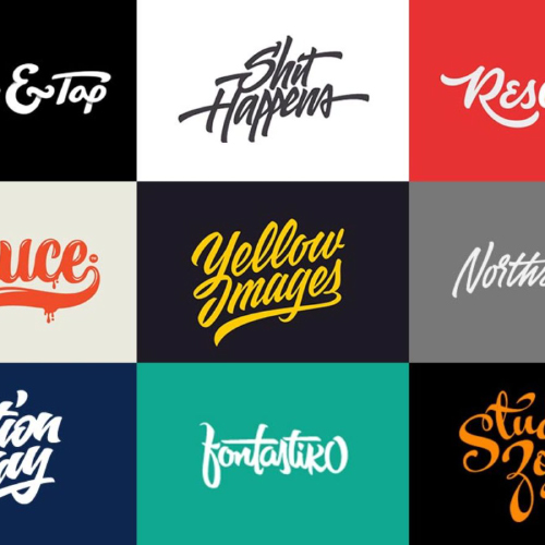
A Wordmark Logo is a text or typography that is used to symbolize the business of an organization. These usually consist of text i.e. the company names and the initials or something of the same kind. These are the names of the companies that are set in some particular type of font. These are well known for delivering the brand message precisely, as they are always quite clear to the audience without any doubt. Wordmarks are also called logotypes and can include the monogram variation for smaller spaces like social media.
They are associated with the alphabets that are easy to read for the customers. It marks its importance with the easy choice of font style, to make the design effect that highlights the brand. For example, Uber and Tiffany and Co.
It highlights its attribute with simplicity. The list of Wordmarks only includes mascots or badges with the company name but not any symbol. It is mostly used in the media, fashion, and food industries.
When a company wants its logo that should be unforgettable for the customers, then they move towards simplicity. As because the logo of any company should be simple and easy to understand because simplicity reflects beauty in a real way. A complicated one will be easily forgotten, but a memorable logo cannot be forgotten even after a long time. A simple design and use of lesser words up to the mark makes it memorable in a way that it remains in mind after a few days, weeks, and even after a month.
Wordmarks uniquely show their simplicity, hence considered as the choice of most of the designers favor wordmarks. These are considered the purest form of a logo. Any organization does not want its logo to look unforgettable, which would lack in communicating the brand identity. So when a company needs a simple one, then it always goes with the Wordmark, to reveal the beauty through simplicity.
When a business deals with a concise and exceptional name, then it goes with the Wordmarks as it directly conveys the company name. It also helps establish name recognition, hence becoming the most suitable choice. These kinds can play a vital role to integrate across multiple platforms like images, colors, and backgrounds. It communicates the brand personality in a clear and precise manner because every word carries some meaning with it.
The logo of a company acts as its face or identity. It holds the power to replace the name of the company with modification and provide it with a beautiful design. Uniqueness plays a major role in the Wordmark being memorable. A Wordmark similar to an already used one will only make it look like a copy and easy to forget, as because most people do not like repeated things. A uniqueness consistently triggers the visual memory cells of the brain and makes it remember.
Developers usually choose colors based on their tastes and preferences. Sometimes this works well, particularly when the designer has a good idea about attractive color combinations and the right color scheme for the colors. Most of the designers would do best to refer to the basics of color theory.
One of the most useful and simplest aspects of color theory is the color combination. This shows how developers create a color combination that avoids straining the eyes of viewers. When text is the main attraction in a logo, color is a great way to differentiate your brand and draw the eye in.
Let us look at some scenarios in which we should think about using a wordmark to represent the business.
Whenever a person thinks to start a new business, then it needs to convey the core idea of the business with the help of the Wordmark. Here comes the need for Wordmark with appealing colors and fonts that allow building brand recognition.
The typeface is the key factor with the Wordmark that emphasizes the uniqueness that will help to get stuck in the minds of the people for a long time. It helps in bringing versatility to the business and brand.
These are formed with the typeface that helps in speaking about the brand personality and helps in the marketing strategy. It provides the trust factor that tells about the service.
It is fascinating because a dull Wordmark logo does not fetch the desired results. A typical one only contains an icon or symbol and a wordmark, etc. Colors and letters are two mandatory elements required in the making that help the Wordmark to become catchy. For a logo to be attractive, the use of colors should be clever and professional. Contrasting colors and brief wordmarks are the keys to making it catchy. These are used to transmit information with the use of words. They hold meanings that we can be recognized with just a glance. They communicate concepts, contents, actions, or interesting services for users of all cultures and languages.
Along with the colors, the typefaces creates key important Wordmark that highlights the personality of a Wordmark, and also send the message to the target audience. The designers have a variety of elements like the shape of letters that we tend to connect with some exceptional functionality, which brings the style and personality of the fonts to the fullest. These also make a large impact on the idea of the brand concept.
When a designer chooses the font, he must pay attention to the terminology of typeface that needs more attention to be paid to make them look attractive. The weight of the font needs to be made with suitable thin or thick characters, like whether it has to be bold, Italic, or normal. Along with this factor, the casing of the characters, like in the upper or lower case, all-caps vs lowercase matters a lot.
It matters a lot as the proper wordings fruitfully carry the information.
Additionally, there are 4 main font families used in logo design to be aware of: Serifs, Sans Serif, Slab Serif, and Script.
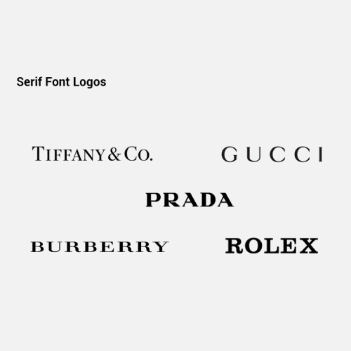
It is old, but the most gold font, which always lasts on the top list. It has its origin from the carvings made by the Roman in ancient times. It relates to the two theories, which shows why the Romans had serifs on their letters. The first theory highlights the carving of letters into the stones, and the stone carvers crafted the serifs while following the outlines of the letters. The second theory signifies the use of serifs was deliberate and they were used to make the ending lines neat, clean, and broad.
Letters with serifs became default; having its invention when Gutenberg invented the movable type printing press, the books were printed in letters with serifs. Because of their origin, serif is associated with the old and traditional way.
It shows the attribute of being unique that this font can be just identified as a perfect logo or web design. Along with every design element, we should ask ourselves which font would be the best fit for the logo design, that attracts the maximum audience. Here comes the serif, which seems to be cool to use.
As in any design area, choosing design elements all comes down to the audience and brief. There is still plenty of people who will be drawn to a serif logo, as it may help us to stand out. It is considered the perfect design shorthand for conveying history and formality.
When there comes the concept of minimalism, then there comes the need for clean, simple, and appealing fonts to get appear in the eyes of people. Here comes the role of serif that enters the stage. These are not associated with serif fonts. They look more modern and stylish.
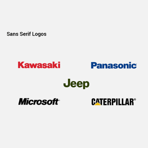
These sans serifs show variations to a wide extent, depending on the period when they were made and their appearance. These have their origination in the 19th century and are mostly used by the people. Their appearance works perfectly with the modern web design. It shows its clear look when used for web articles. They enable cleaner-looking, appealing text and increased readability. These are typically used in more modern brands, like Google and Calvin Klein.
The serifs can be tricky for scalable logos. The original purpose of serif might be a practical choice as well as an aesthetic, that would help to attract a wide range of customers. If a company designs a print document, like newsletters or magazines, corporate documents, or a whole book, these plays the role of friends, because the more text you have got to deal with the easier serif will make it to read.
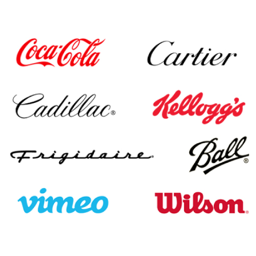
These probably show their origination in the handwriting style. They have very limited use in the field of web designing. They do not work in the field of body text. They show their use in really short phrases and titles. have a more elegant, personal touch. They can look like a signature, like the Champion logo, or appear like formal calligraphy, like the Cadillac logo.
They do not have much in common aside from the fact they look very elegant. The brush strokes vary from font to font, as well as widths and the way the letters are drawn. We can find them mostly on the logos of sophisticated restaurants, beauty brand logos, packages, and posters, that brings eye-catchy feeling to the customers, ultimately taking the industry to the height of success.
They are pretty versatile, and can also be used for a bunch of other things which makes them a great part of the design industry.
These have a sense of elegance and sophistication associated with them, which adds appealing beauty to the logos. These could enable any business to work smartly rather than effortfully, which would help to make things easier. These are considered as the best option for the page that is on the way, which adds a wow feel to the logo designs.
When the fonts are used in a precise manner, typography can convey a certain emotion. It could be used to convey the right message to the audience, which would help to understand the concept behind the brand or product. The simple presentation of the fonts build the tone, and appearance of the Brand Name and Logo.
The correct use of typography in a Wordmark design reflects the great professionalism of the business or brand. It also helps in gaining the trust of the consumers, which would help in the growth of the brand, by bringing progress in hundredfold. The professional approach of design includes typography at its peak.
When we talk about the advertisement or show the exciting features of the game; that time we need to design content that is fun, playful, and glamorous. When the content requires some seriousness, then a business look for fonts that are simple, plain, and professional. The Wordmark Typography determines how the content is understood.
It is the type of Wordmark Logo. The Google logo appears in numerous settings to identify the search engine company. Google has used several logos over its history. Google logo is supposed to symbolize that they do not play by the rules and know how to have fun. They chose to convey their message with color.
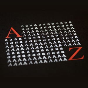
It is the type of Wordmark Logo. The word Amazon means Massive, and that is what Amazon wants to portray. They sell everything from A to Z and the Smile also goes from the A to the Z and represents the smile that Amazon puts on the faces of the customers.
It is the Wordmark Logo, that consists of the name and mixing of two colors. Colors include the combination of white and red colors, which symbolize strength, passion, love, and energy, with purity and nobility.
[The images are being taken from the registered companies and belong to their respective owners only.]
Submit Design
Height and Width should be the same (e.g. 1000 x 1000)
Supported file formats : .JPG / .JEPG / .PNG

Submitting...
Submit Design