Notifications
Logout
Are you sure want to logout?
Yes
No
Notifications


Full Name
Enter full name
Contact Number
Enter contact number
Enter valid contact number
Email Address
Enter email address
Enter valid email address

20 Nov 2021
20 Nov 2021
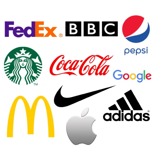
A Logo is a design or image that is used to symbolize the business of an organization. It is also used to identify the products, uniforms or vehicles, etc. Any company, organization, or brand keeps it at the apex of all the other things. It is the first point of sharing the thoughts of any brand with its target audience. It acts as the soul of any brand. A brand is nothing without it. Let us move forward and look the key factors to be considered in the designing a Logo.
An Iconic Logo is the concept where the symbol represents the identity of the brand in a simple form, which always shows a clear picture in communicating a feeling, brings exceptionality and versatility to its design. For example, Apple or Twitter Logo.
Simplicity is the ultimate sophistication, the words said by Leonardo da Vinci. Along with this, Nature is pleased with simplicity, said by Sir Isaac Newton highlighting the importance of simplicity in our life. The simple being of any person or thing catches the attention of maximum people. This simplicity marks its importance in every field, from the dressing style of a person to graphic designing and logo making as well. Once the Iconic Logo personifies itself in simplicity, then it can occupy its place in the heart of a maximum number of customers.
Many people consider simple as a boring part of life, but they forget that it makes any design easy to understand. When most of the industries want to highlight the brand sharply and appealingly, then they opt for the one that brings simplicity. The gathering of many uninteresting elements brings complications in understanding the main idea behind the design. So simplicity plays a significant role in helping the customers understand the exact message behind the brand. The simple logos are not only interesting but are also easy to understand. They can be remembered even after a long period. It helps to get recognized among the crowd of competition.
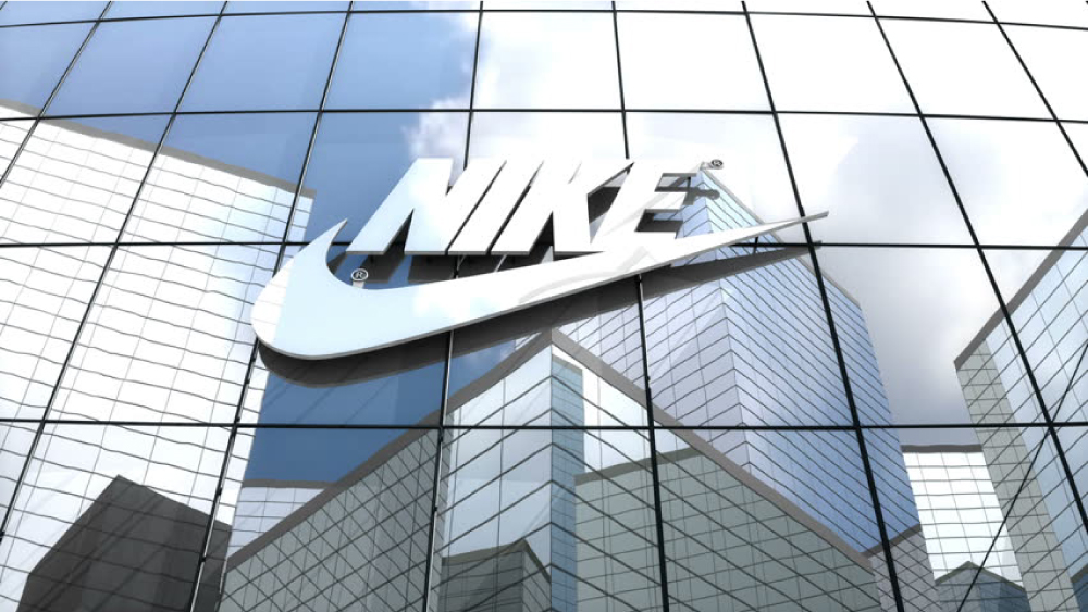
Nike uses a very simple graphic swoosh to represent their brand simply and sharply. In Greek mythology, Nike is the Winged Goddess of Victory. Hence, the logo is derived from goddess wing, swoosh, which symbolizes the speed, movement, power, and motivation of the industry to help its customers in taking long leaps to go high.
It acts as its face or identity. It also holds the power to replace the name of the company with modification and provide it a beautiful design. Its uniqueness plays a major role in becoming memorable to its customers. A design similar to an already used one will only make it look like a copy and easy to forget, as because most people do not like repeated things. Nike consistently triggers the visual memory cells of the brain and makes it remember.
Iconic Logos are versatile and indicate the attribute of it that makes it equally great at all sizes and across all applications. It marks its presence at every place the designer wants to use it. It looks great at all sizes and across all applications, which brings effectiveness to its design.
This attribute marks its presence in designing business cards, labels, websites, and many more in the graphic designing industry. These always make the it more impactful and legible. It associates the small elements in a fine way to bring essence to the design format. It shows the detailed form of the design to highlight its uniqueness in the business.
These are responsive and adaptable in the graphics industry.
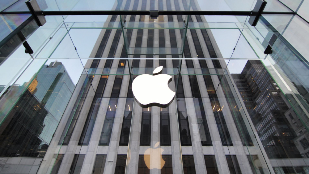
Simplicity marks beauty when as it shows uniqueness. After returning to Apple, in 1997, Steve Jobs wanted to build the identity of Apple get recognized universally. Though there was a unique Rainbow associated with the Iconic Logo, it needed to be brought change with the modern style. Here came the need for a new concept that decided to bring the new form of bitten Apple in a Monochrome format.
The company today uses a more modernized and conceptual flat Minimal form. It mainly highlights Three colors; Silver, White and Black. It has marked its presence amongst the famous logos in the world.
The logo of bitten Apple shows a clear image of the brand and attracts the attention of the customers. It helps to associate the maximum number of audiences with the brand and engages the people with a vision of the industry. Its attributes make it versatile which brings professionality to the services.
It tends to bring passion and energy to the business giving the devotion to work. This highlights the determination of the industry to satisfy its customers and ultimately raise the standard of the working culture.
Scalability is an essential component in the designing of a logo. It gives priority that helps to escalate the business to the peak. This also provides a better user experience, which makes the work efficient. Scalability is one of the important characteristics of the Iconic Logo. This helps the business to grow and achieve success. scalability is important as it ensures that your business can maintain growth once it is achieved.
Scalability brings common business goals of growth and profitability, along with scalability is important in adjusting to changes in consumer demand and the overall market. Making a good logo signifies that it is going to show a clear picture, even after getting scaled down to a small size. This provides flexibility to the business.
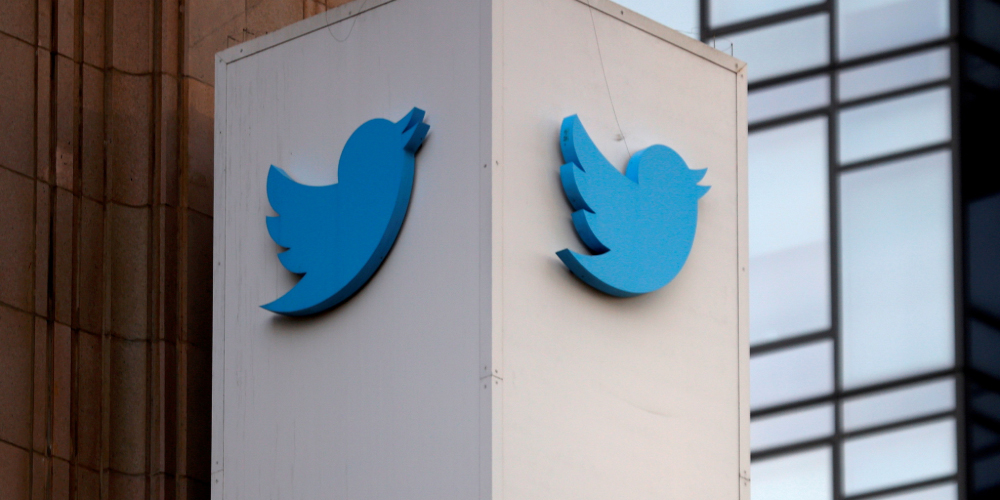
It was named Larry T Bird, with the inspiration being the basketball legend Larry Bird who played for the Bolton Celtics.
This was the time when there arisen the image of a bird in the minds of the founders that started its appealing characteristics of habit i.e. the nature of a tweet that indicates quick and short, just like the noises a bird would make.
The bird Icon reflects the essence of purity as Twitter sounds a lot like the tweet, which is a sound made by birds.
A bird symbolizes freedom and endless possibilities. Short messages are delivered as fast as birds fly, hence the name given.
Any industry wants a design to always be catchy to the eyes of the clients. When it becomes distinctive, then it ultimately becomes memorable for the customers, which would enable them to remember the logo for a long time. This helps it to stand it out from the crowd at the market. The customers get impressed easily, as they could be able to recognize the distinctive design easily. This brings the interest of the customers engaged with the industry.
Distinctive logos are also more likely to get the attention of the consumers and make them get attached to the business nature. If people are not able to recognize the design after a long period, then it loses its importance. So it is very crucial for a designer to make the iconic logo distinctive. If a designer wants to make a creative and distinctive one, then it should be different from our competitors and stand out amongst everything else.

The McDonald logo is an excellent example of a distinctive design. It is the simple and distinctive one that attracts a wide range of customers towards its business.
Two golden arches that create a unique letter M helps in making its identity around the world. It has a significant role in creating its brand image. Its famous arches form the part of its design.
Its logo indicates the symbolism of the golden arches that were the substance of the newly-constructed architecture of the first franchised restaurant in 1952.
It highlights the Golden and Red as primary colors, which represent the famous arches of its first franchised restaurant, while the Red color represents the food industry. It uses the McLawsuit font in its name. It inspires the customers in a great way that everyone looks up to it as a symbol of excellence.
Fonts play a vital role in giving an artistic presentation to the written language of logos, which can be legible, readable, attractive, and appealing when displayed.
It includes the elements like the size of the letters, line length, and spacing on a line. It helps to convey a certain emotion. It could be used to convey the right message to the audience, which would help to understand the concept behind the brand or product.
The simple presentation of the fonts builds the tone, and appearance of the Brand Name and Logo.
The main aim of any font is that it should be properly visible to the human eye, clean, medium-sized, and alluring. The fonts that could be easily read acquire prominence in the marketing strategy. It also helps readers to perceive information from the text, along with adding value.
The shapes are considered the most significant part of designing a logo, as it provides a structure to the design. Logos can be structured in different shapes and designs to associate the business nature with the target audience. Let us look at its types concisely. Let us see how the shapes in the Iconic logos matters the most.
We all are aware of Geometrical shapes, Circles are one of the most important parts of it. This plays an important role in bringing key features to the design. When a brand uses a circle in the formation of a logo, then it conveys a positive message to the customers. As these seem softer, appealing, and engaging with respect to the perspective of different businesses.
The use of circles symbolizes the unity of the business of the brand that connects the idea behind the services directly to its target audience. This helps to create a strong bond between any industry and its customers.
It also signifies the strength at times of misfortunes, that always keeps the industry stable. Their continuousness highlights the reliability of a business. Many Iconic brands in the world use the circle shape in designing their design. It represents the stability to run the business on the pavement of progress, which brings the development in hundredfold. It marks the perfectness that associates the design with the brand identity.
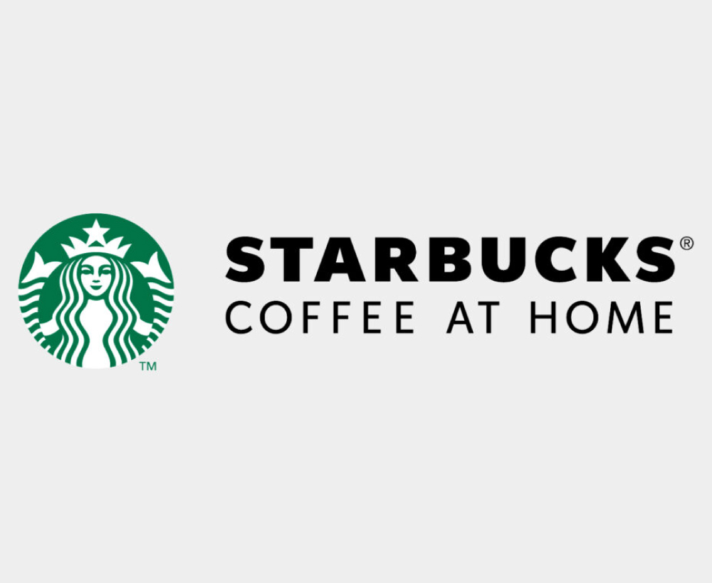
Starbucks was starting to sell more than just coffee drinks, to expand their business even further by offering their customers with more product options. Today, Starbucks does not only sell coffee, but also the breakfast foods and tea.
The siren icon of the logo has stayed and will always be an important part of the brand identity design. Its visual identity has always made it stand out from the crowd.
Starbucks has made its stable place in the market makind itself a brand by contributing the Coffee brand globally.
Square is another example of Geometrical that marks its importance in depicting the balance on all the sides. It highlights the strength and stability that bring a proper proportion to the formation of a logo. It also develops the sense of power that surrounds the design and highlights a form of protection. This highlights the professionality of any industry that builds up trust with the customers.
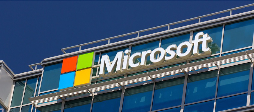
All of us know that, Microsoft established itself as one of the most creative software brands. Its operating system, Windows, and the line-up of Office software products, highlights exceptionality of its services. The image created by the company, made it a brand that will last in the minds of the people for a long time.
Microsoft Office 365 consists of a combination of cour colored Squares. This refers to the Iconic logo symbol of Windows. Its multi-colored part indicates that Microsoft 365 includes a variety of creative concepts interlinked with each other to form an appealing design.
The icon symbolizes the Windows system. The design is simply featured with four window panes of different colours, Red, Green, Blue and Yellow. This window version of the logo got personified from the flying windows to a static one. It also emphasises the innovation of the company in technology, which it offers people daily.
Triangles are also one of the most important shapes in Geometrical design. This marks their popularity in the making of logo design. Triangles create an appealing and tricky design style to the design.
It brings dynamic significance and positivity to the business nature. It arises the feeling of safety with the services offered.
These are a little tricky to work but bring innovation after the creation. Many brands effectively use these shapes to bring uniqueness to their design, which helps to boost brand awareness and make the logo looks exceptional standing it out from the crowd.

The logo of Google Drive is significantly appealing. Triangle in Google Drive represents the protection of data.
The design signifies the security of information, which is formed by the association of three principles: confidentiality, integrity, and availability.
The logo is formed with the association of a Blue color that indicates DOCS, a Green color that depicts SHEETS, and a Yellow color that signifies SLIDES.
It is formed with the idea that shows the concept Three, it also symbolise the protection provided to the data, which remains secured.
[The images are being taken from the registered companies and belong to their respective owners only.]
Submit Design
Height and Width should be the same (e.g. 1000 x 1000)
Supported file formats : .JPG / .JEPG / .PNG

Submitting...
Submit Design